Full | Jolby 2021

Full

In 2020, a food pantry that was opened in SE Portland during the pandemic quickly became a community staple. Hundreds of neighbors came to use the resources that were offered, revealing a vital need. Soon after, Full was born.

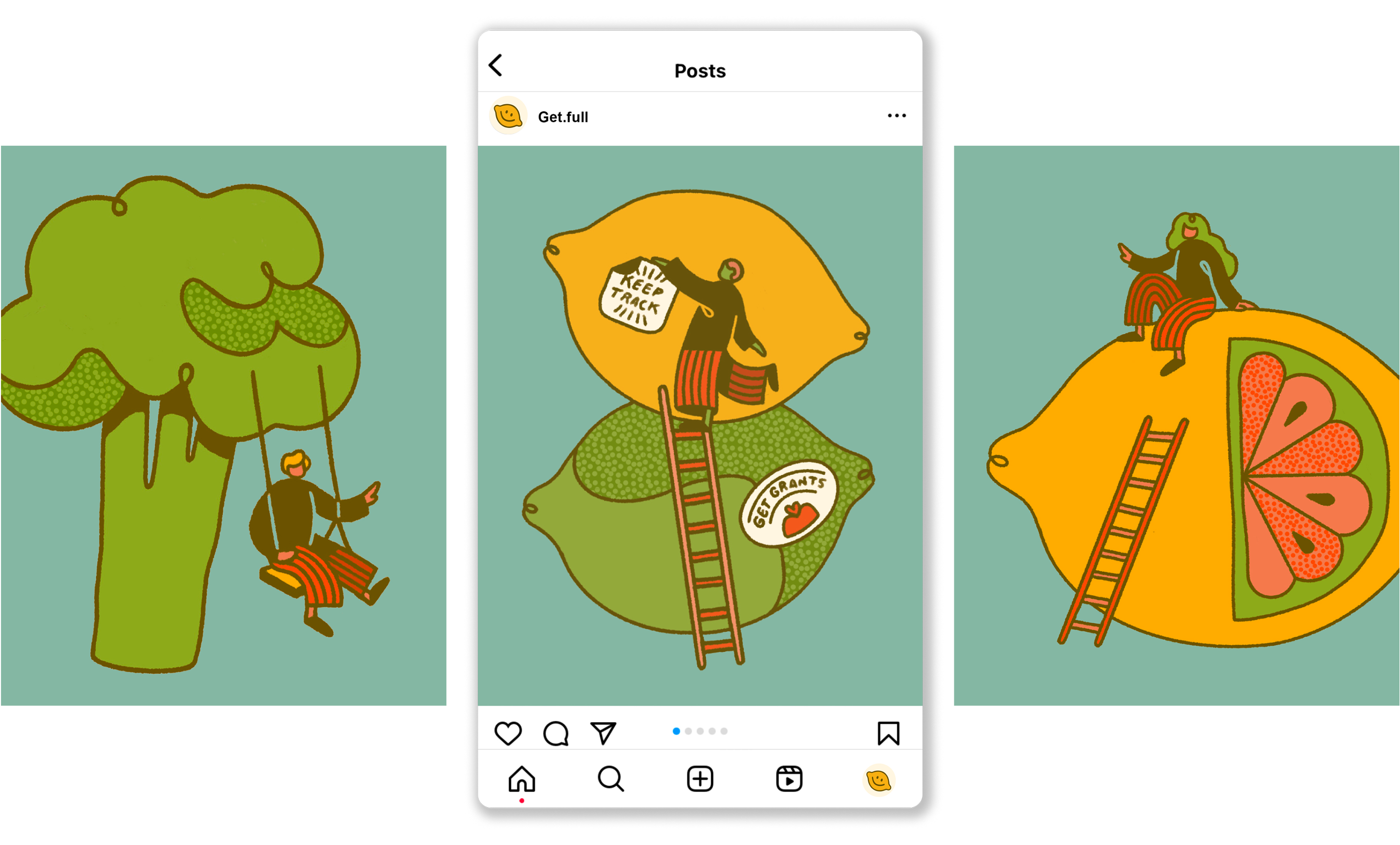
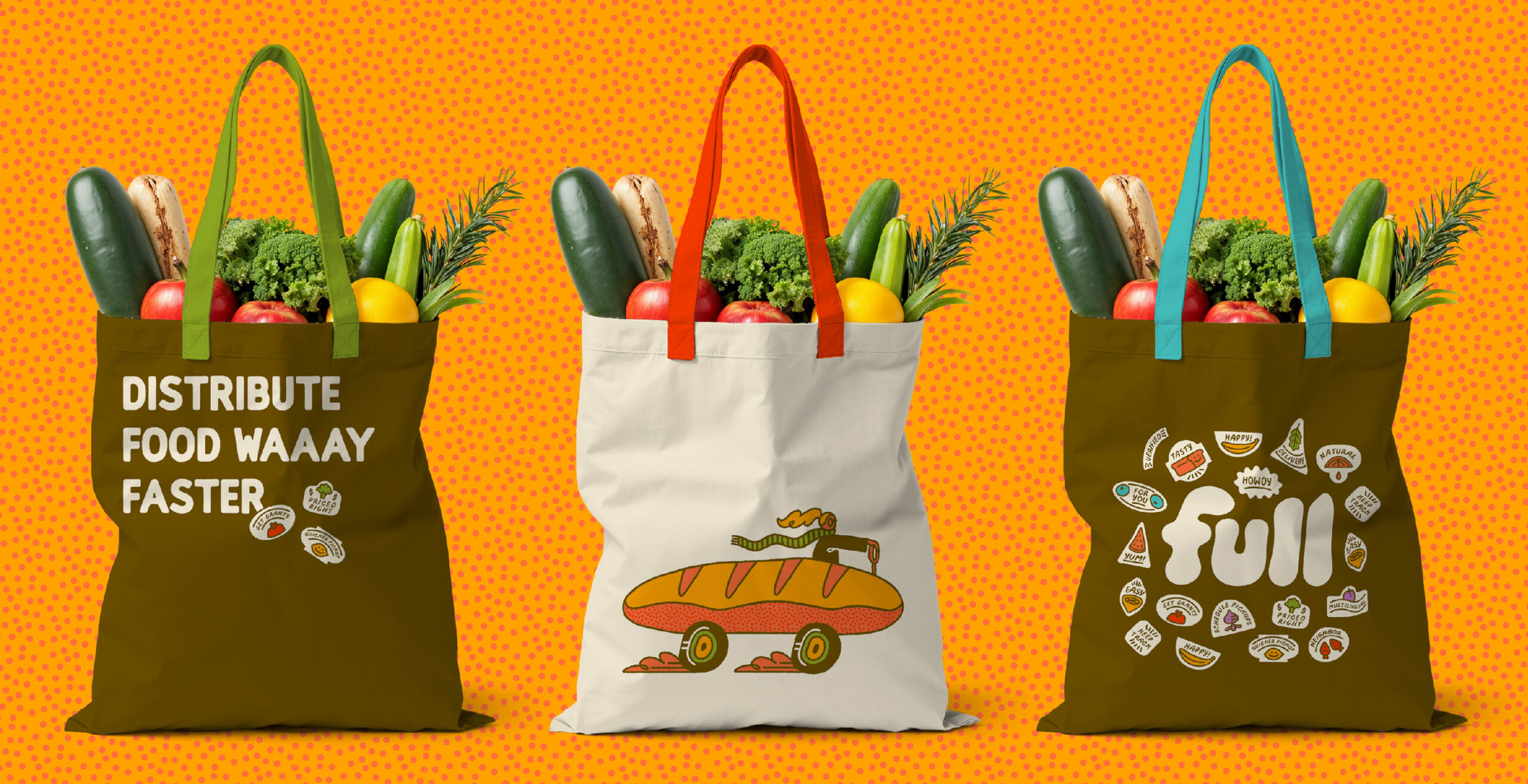
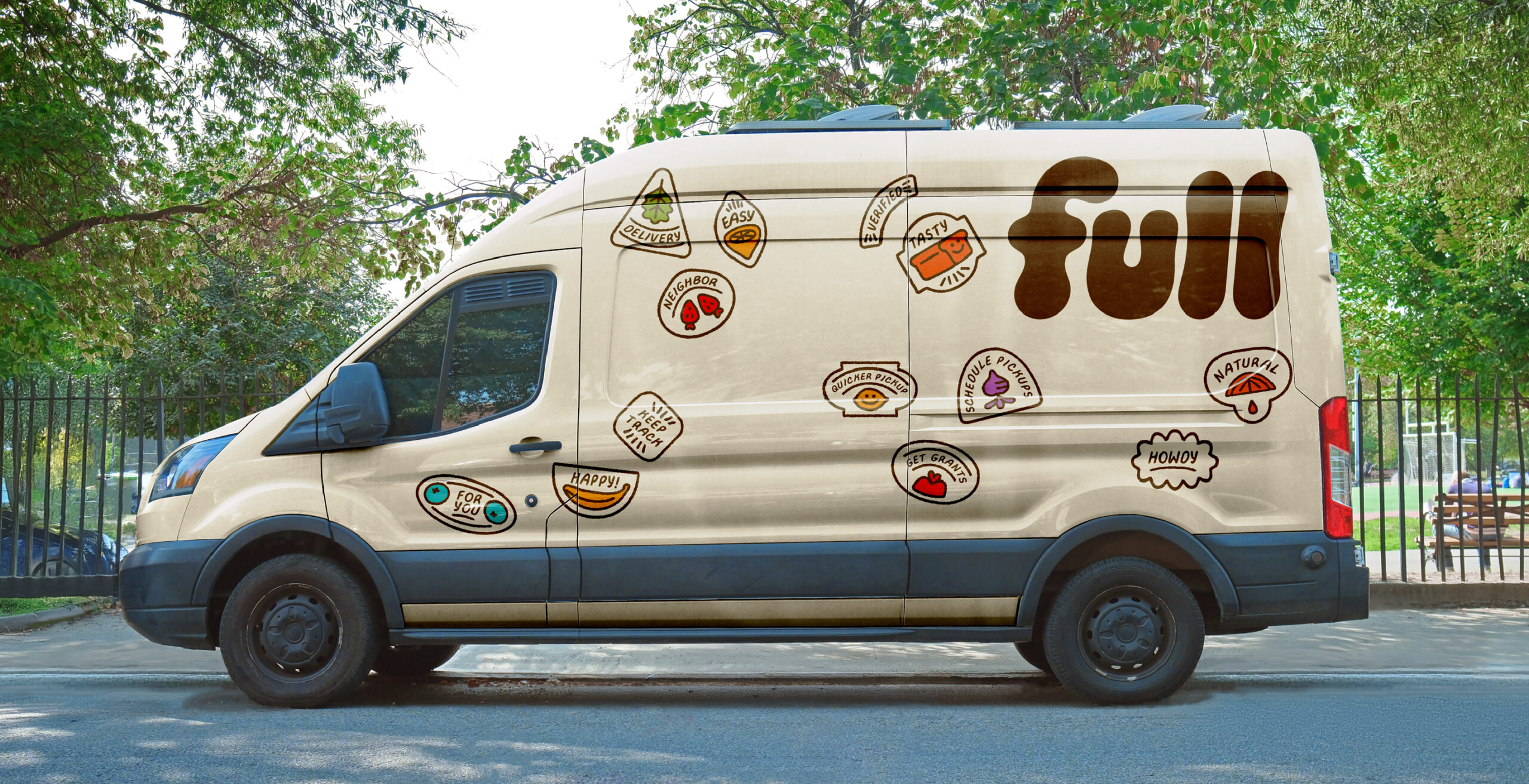
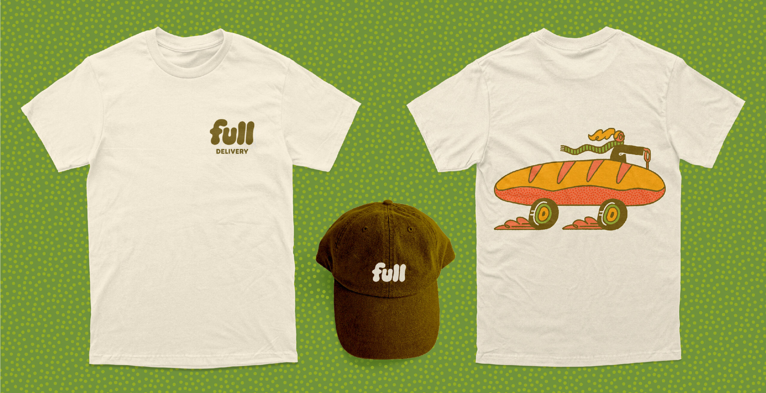
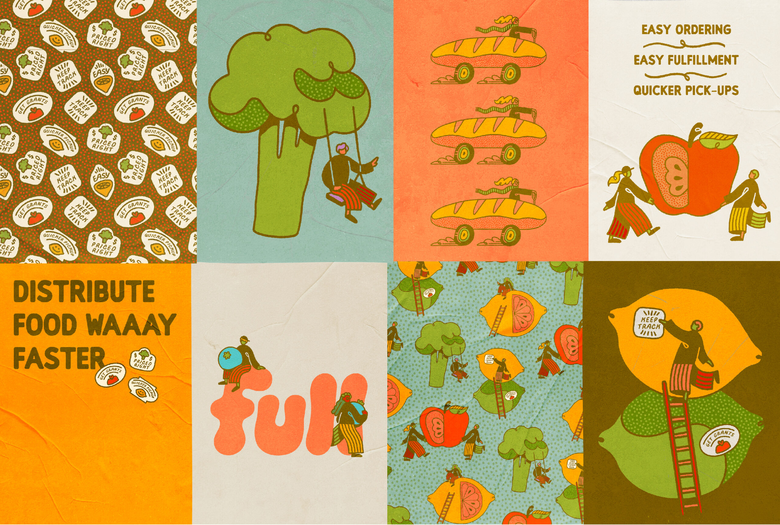
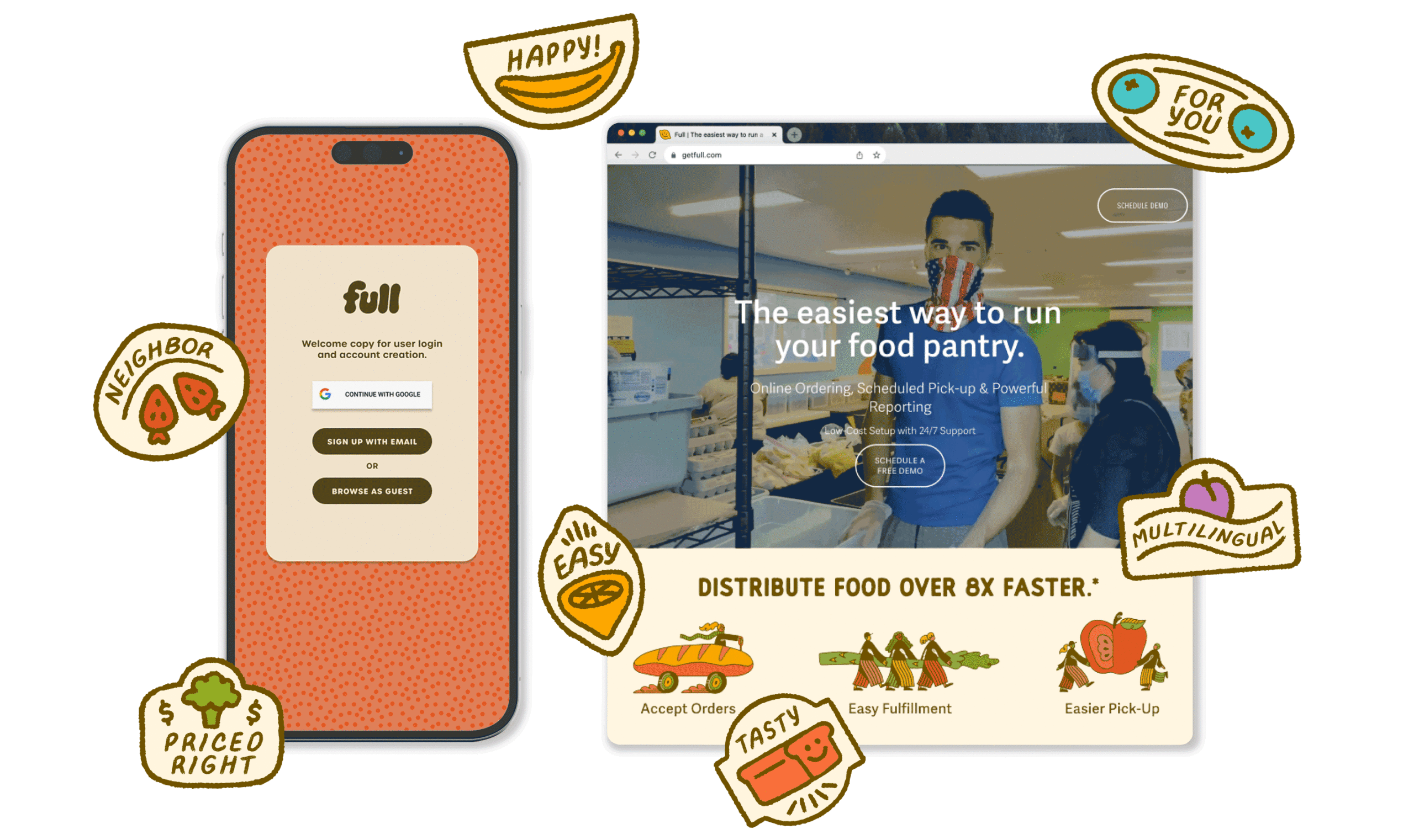
Full is a Portland-based tech team dedicated to making essential free resources like food pantries and groceries widely available to those who need them. Full makes reserving groceries in advance and ordering in other languages possible, greatly decreasing the gap between providers and those in need. They approached us to help them create their visual identity, and the work we created for them reflects their founding goals. It brings together design elements that are bright and lively while still feeling effortless and welcoming.

ROLES

Brand Design
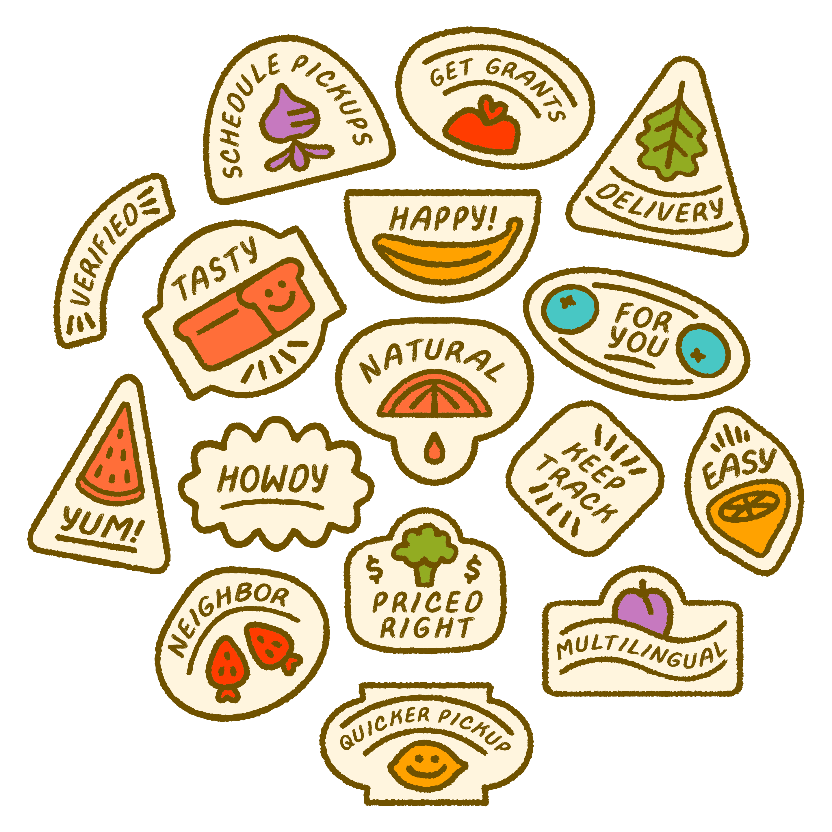
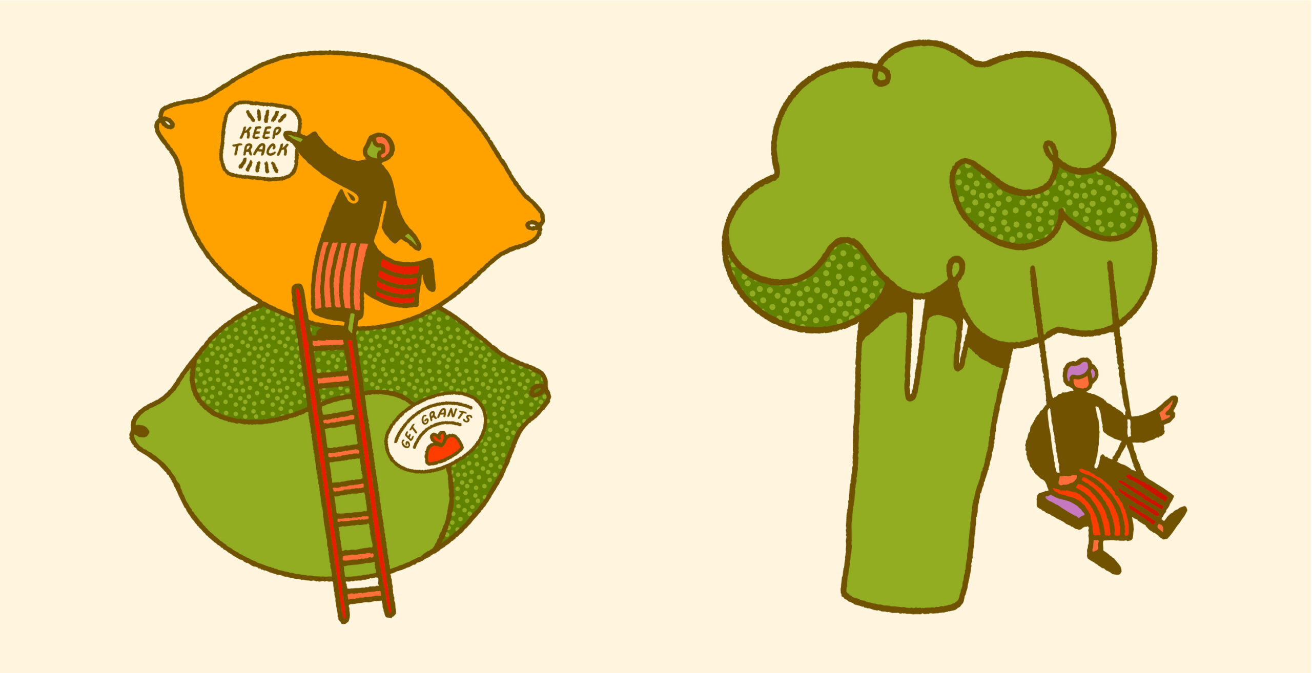
Illustration Asset Library
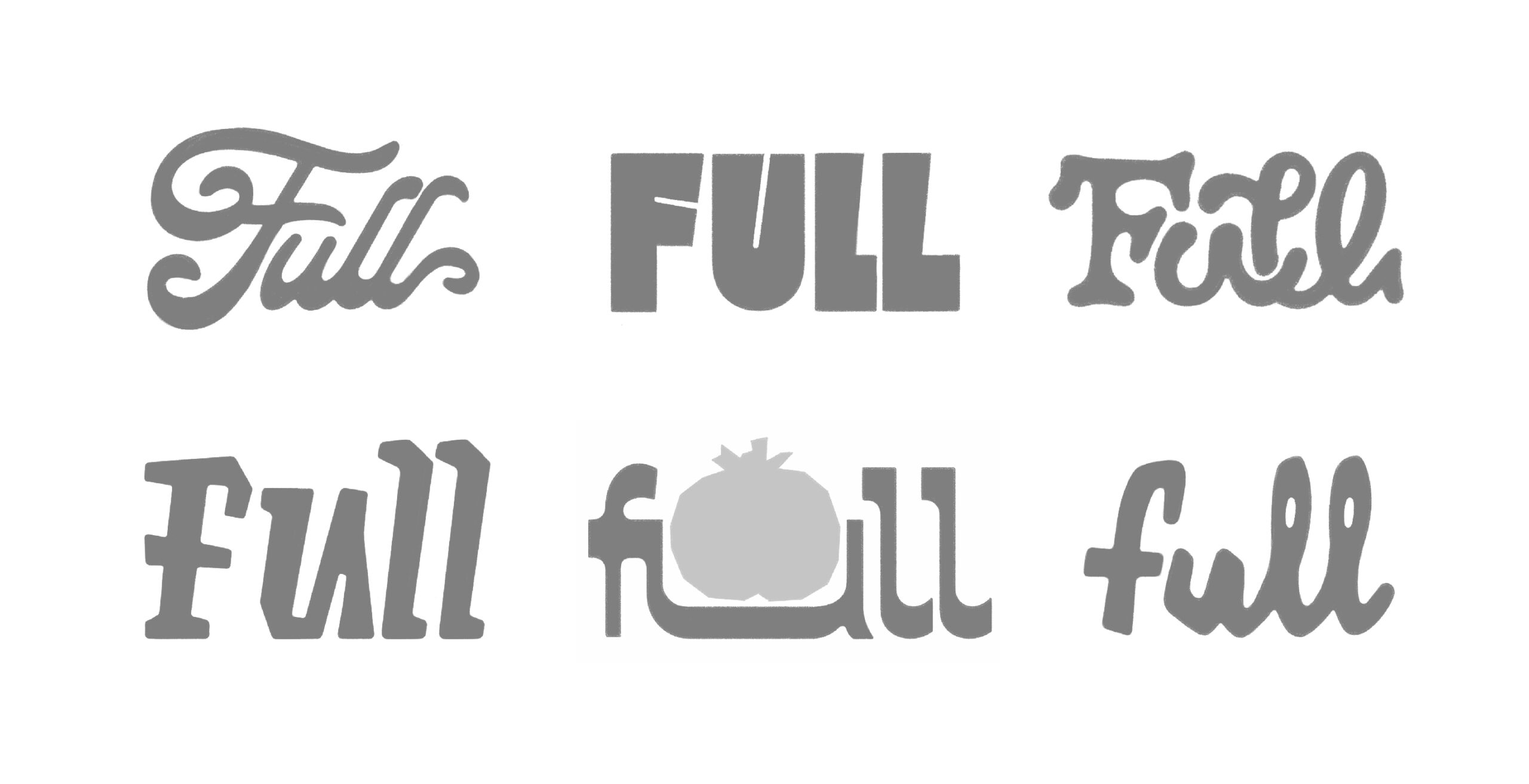
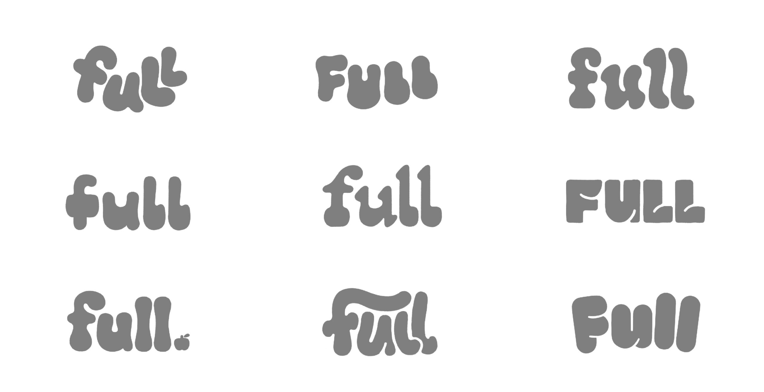
Custom Typeface
Design Process

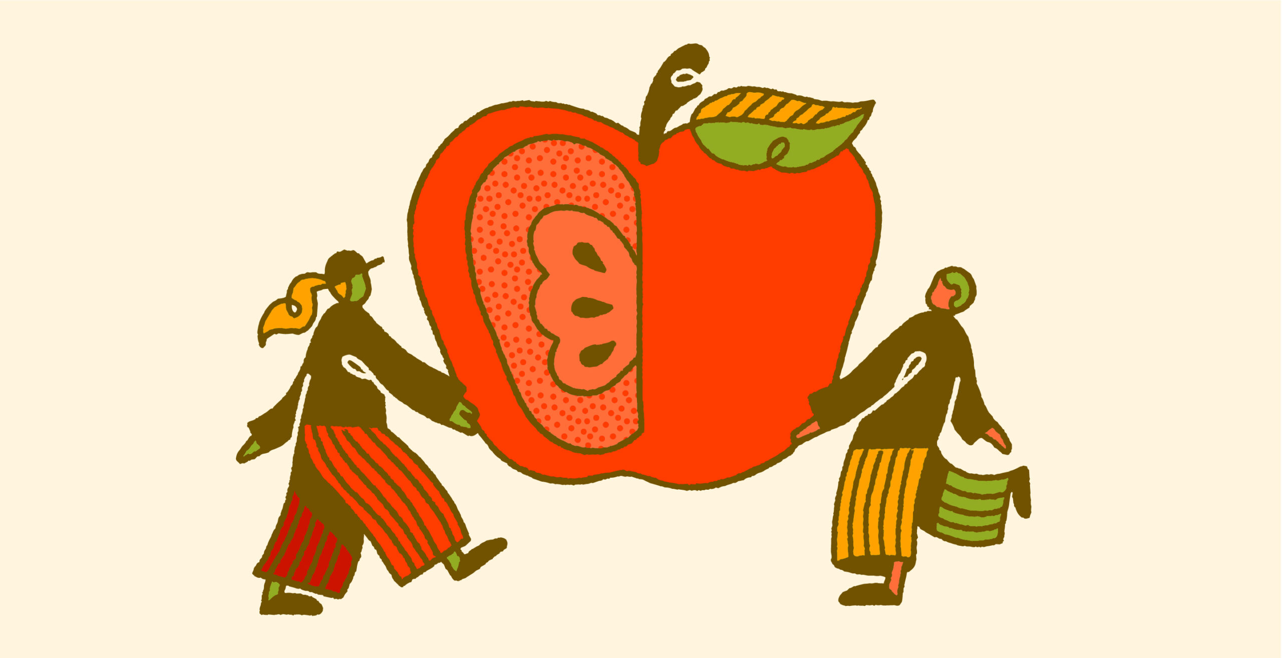
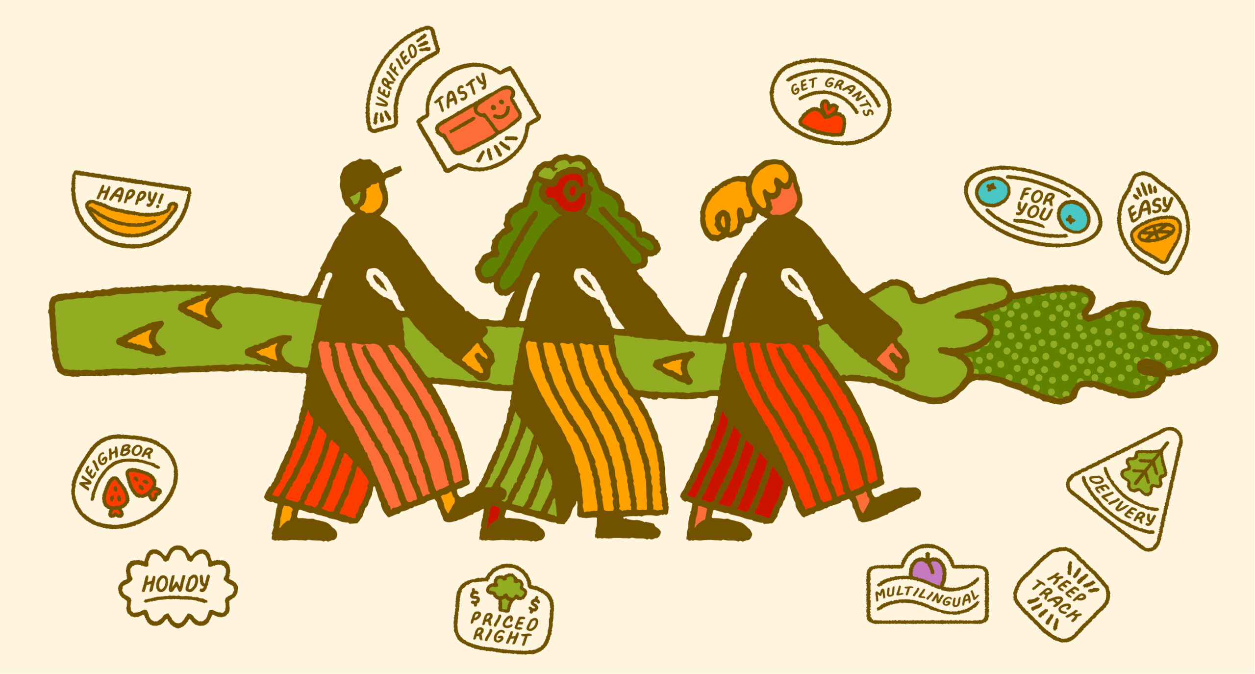
In discussions about how to make the perfect brand system, one of the key factors that the team at Full highlighted was the importance of destigmatizing the use of local food resources. Our mission from the very start was to create an identity that emphasizes the real core meanings of mealtime: community and shared joy.

Custom Type

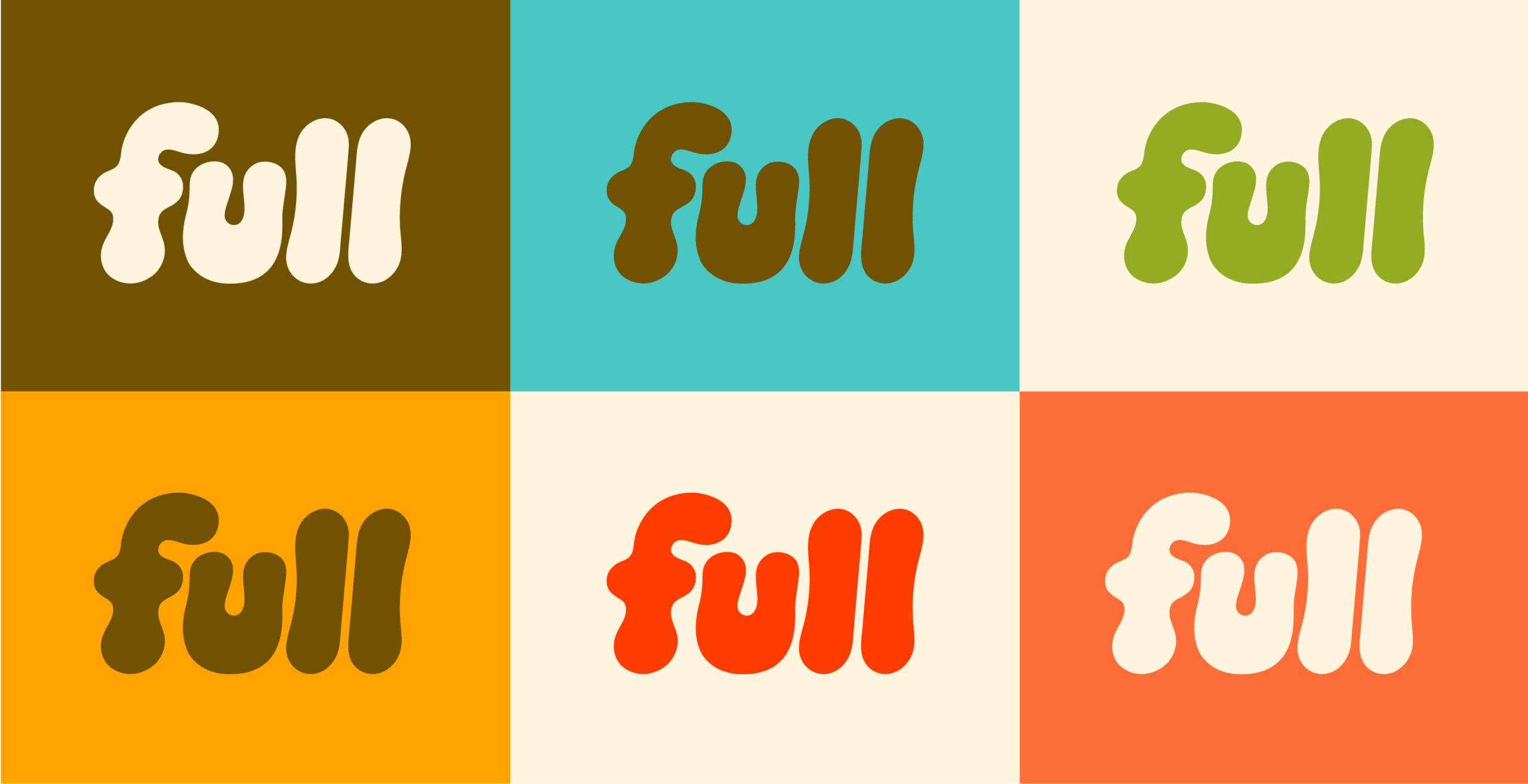
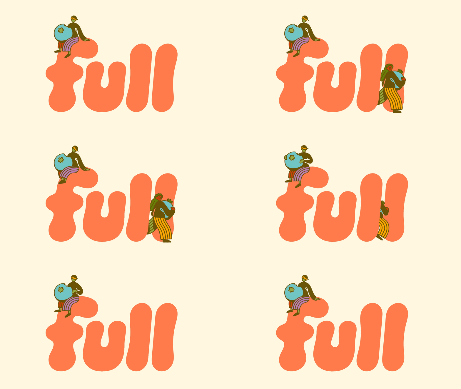
An essential part of the project, and a major way Full’s brand system came to life, was through the custom font we created for them. Called Shanny’s Hand Sans, the font feels positive and upbeat while also being straightforward and easy to quickly absorb and read.
Full has helped and served over 155,000 Oregonians to date!
TY Friends

Creative & Art Direction

Jolby

Design & Illustration

Jolby