Oregon Parks & Recreation Department
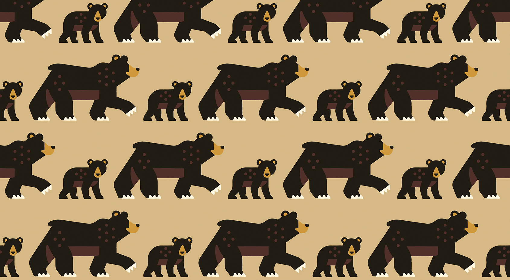
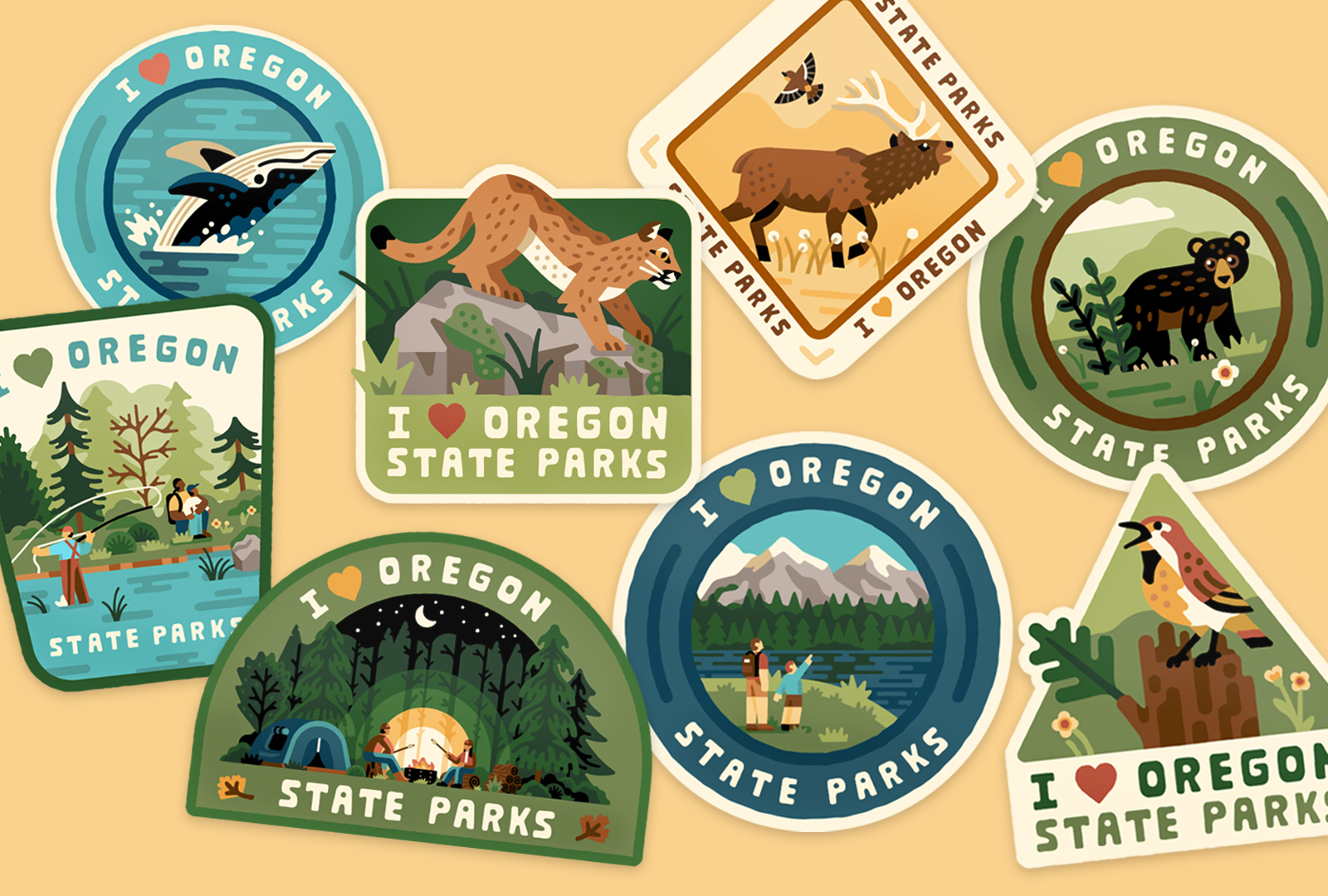
Oregon Parks and Recreation Department came to us to create a library of assets. They were in need of a robust illustration library that could support and unify their communications internally and externally. They wanted an asset library that felt fresh and exciting to reinvigorate generational parkgoers as well as welcome new patrons to experience the treasures of Oregon’s landscape.
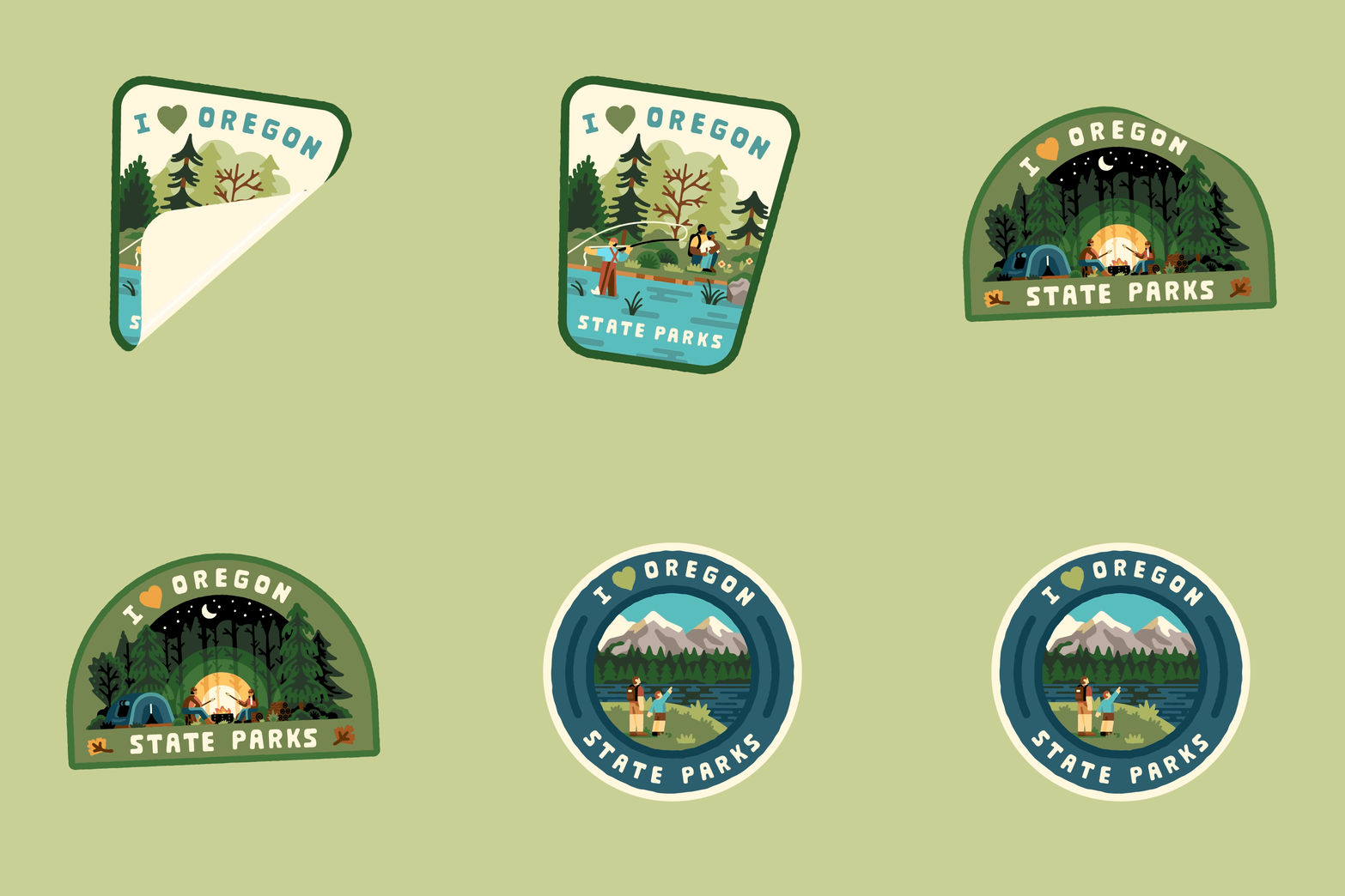
The goal was to create a library of assets that the OPRD team could use to create communication across all platforms. The system needed to be modular, and customizable, with hero moments that can be coupled with smaller elements for extra storytelling.
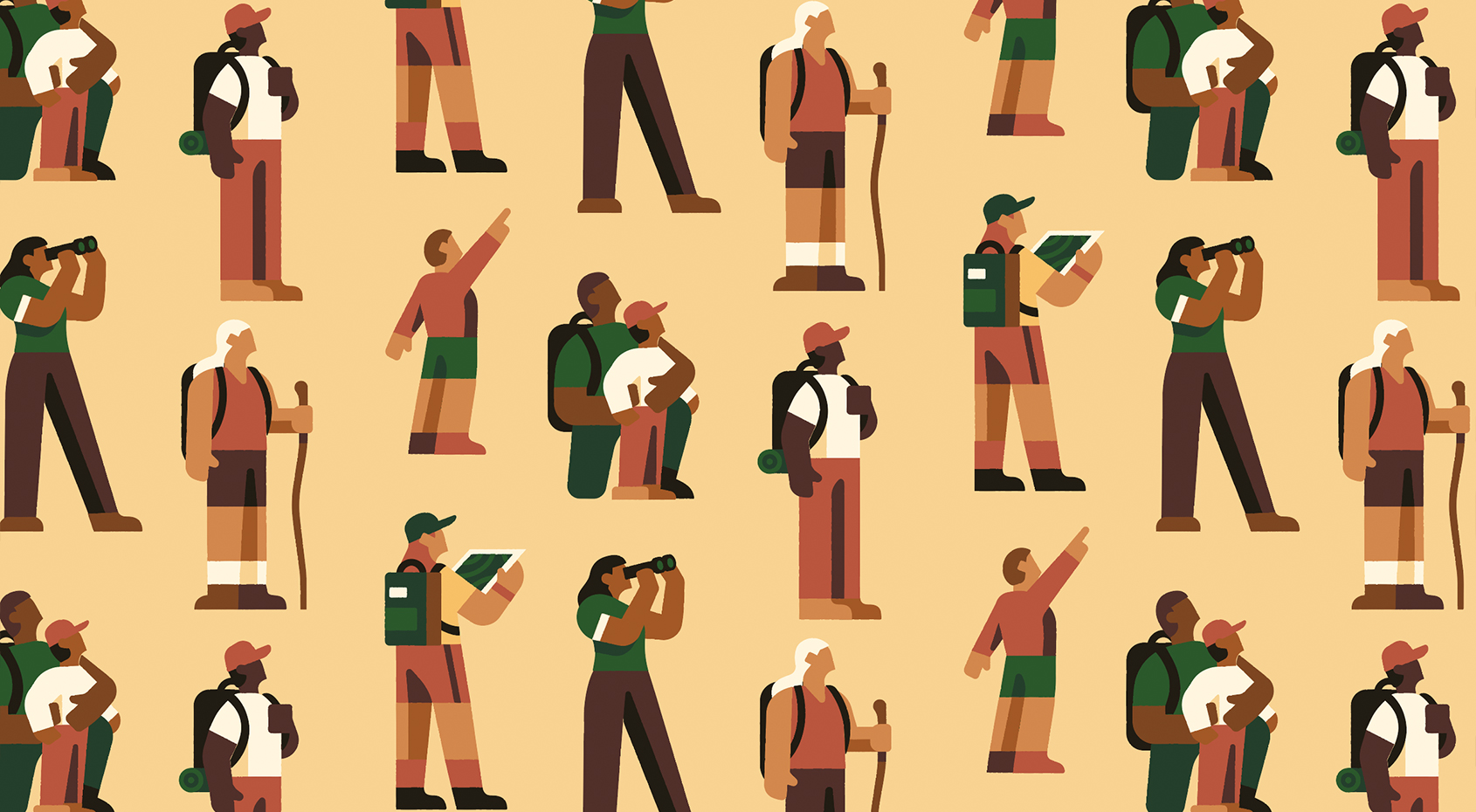
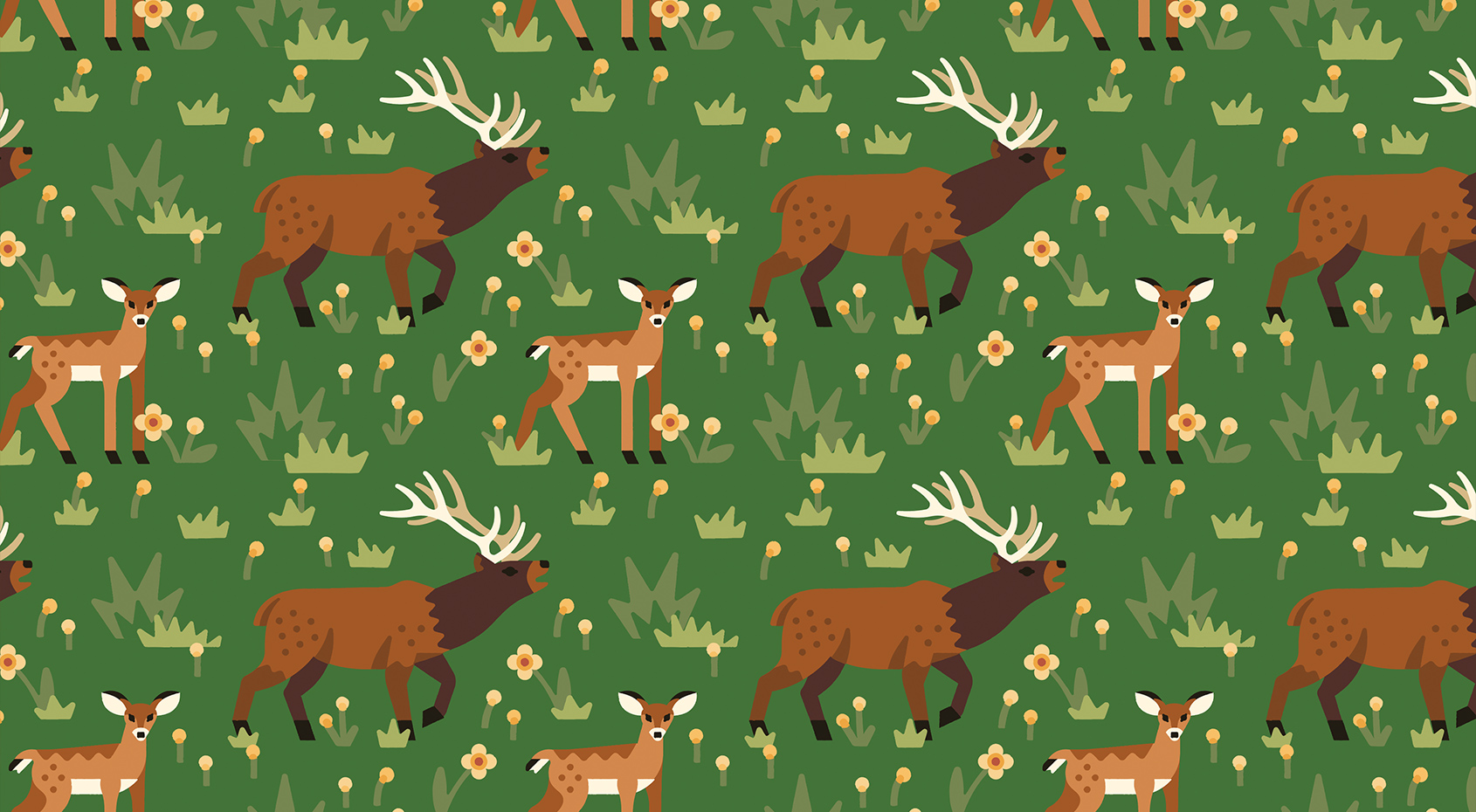
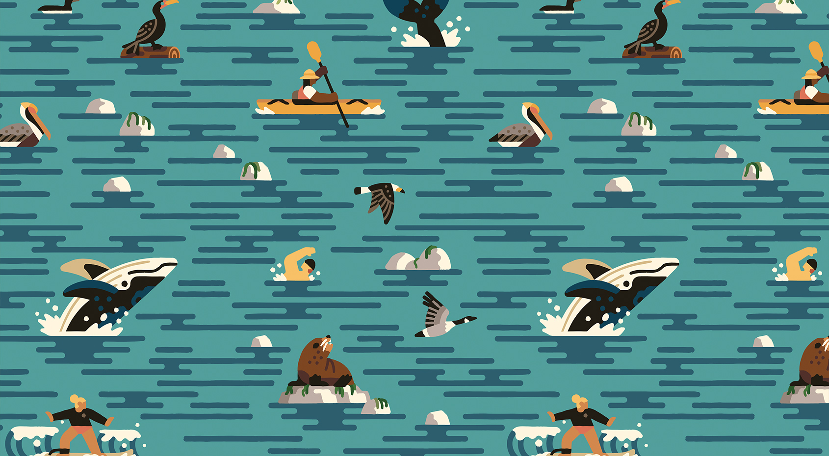
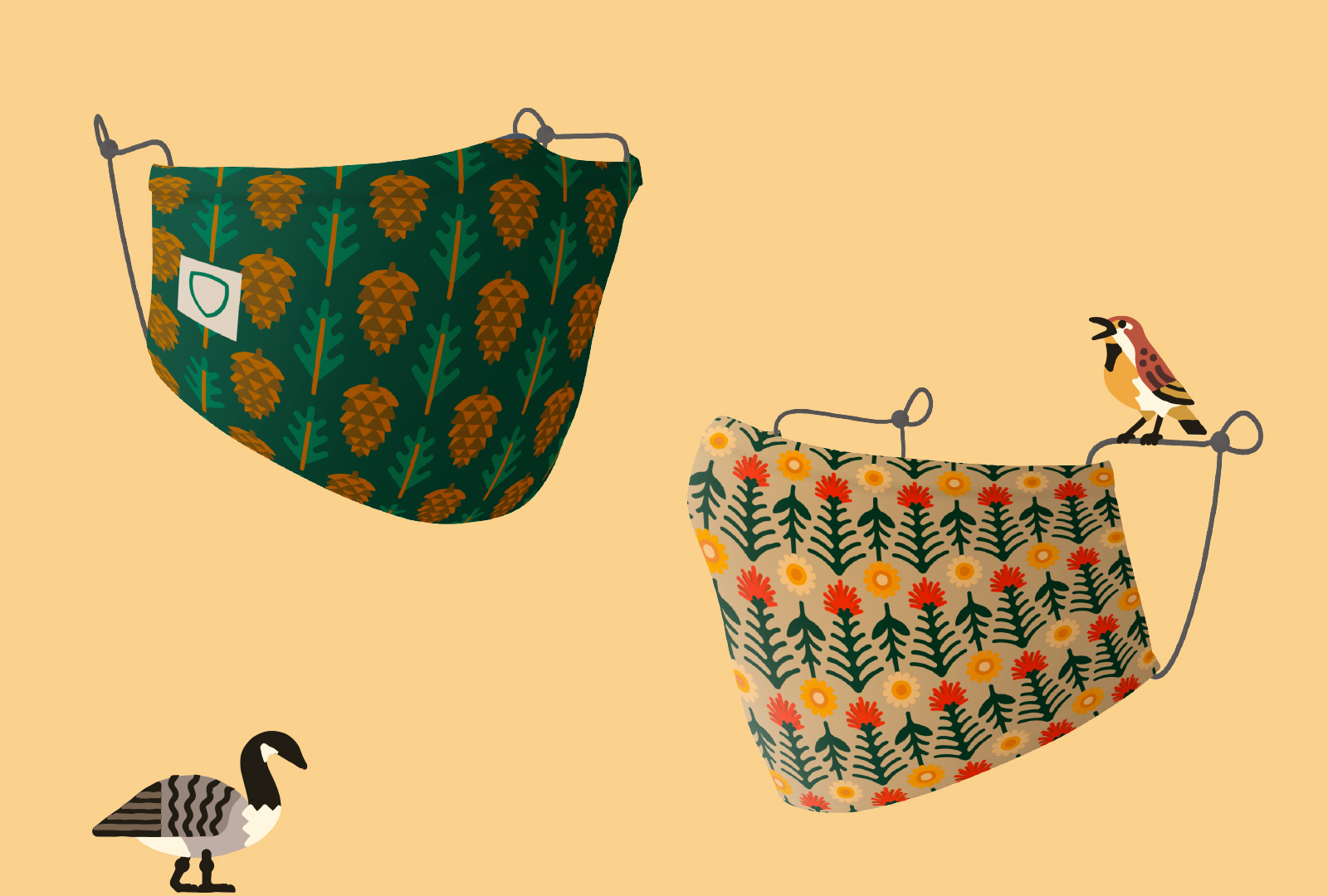
It needed to contain illustrations, photo container shapes and patterns. All assets needed to be easy to size, change, and edit—with a consistency that stretched across the whole kit. As well as being easy to use for any person regardless of skill level.
The creative also needed to challenge existing power structures and systems of oppression, including colonial and classist views of the outdoors. The hope was to bring a more inclusive and diverse lens to OPRD.
ROLES
Brand Design
Illustration Asset Library
Custom Typeface
Usage Guidelines
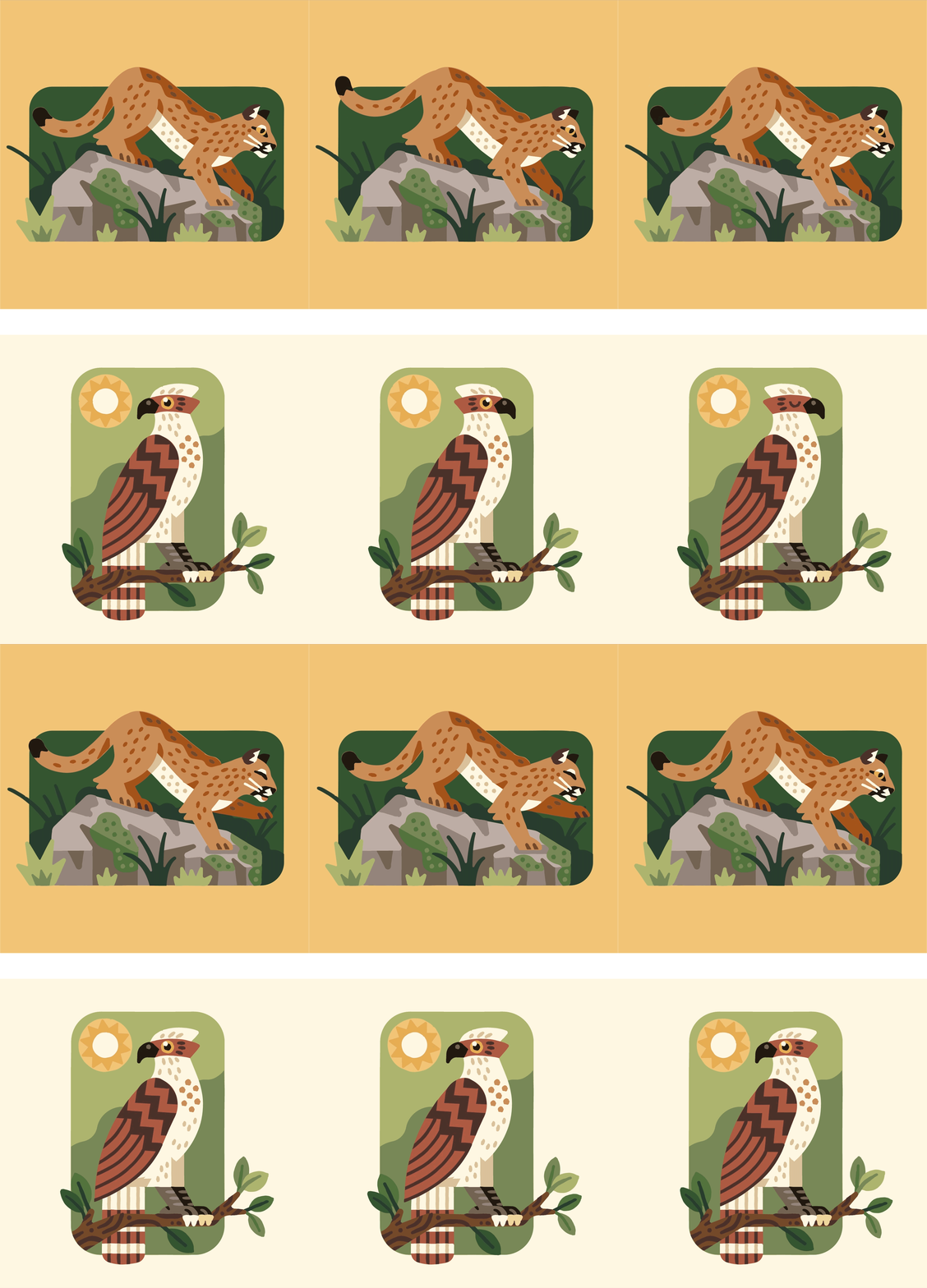
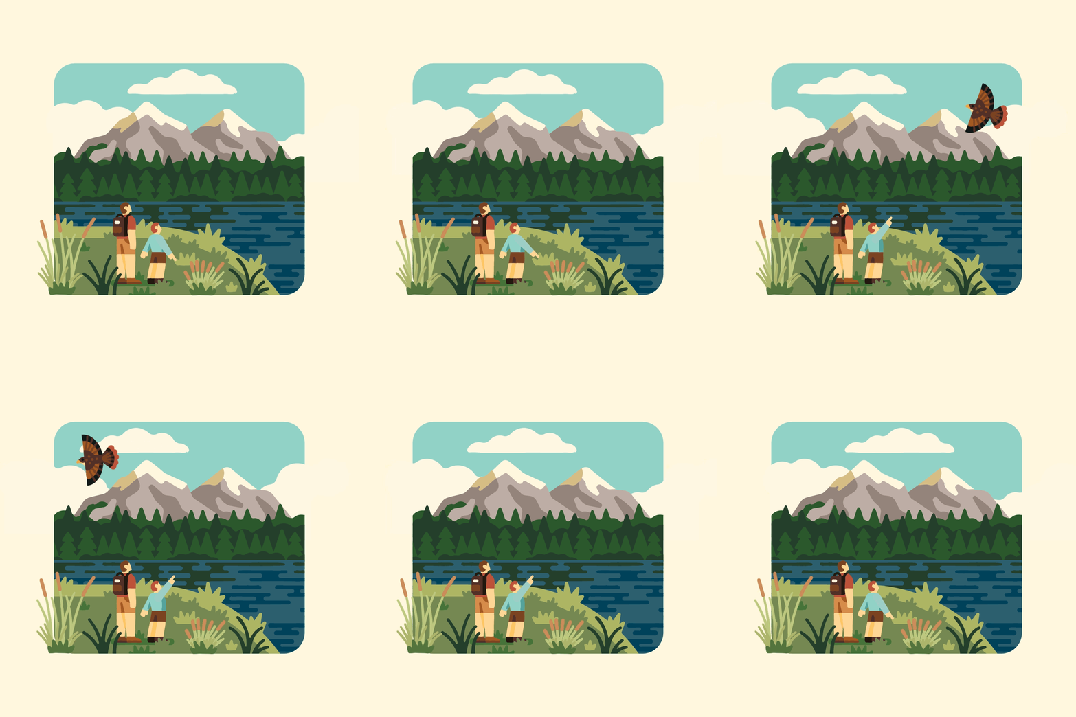
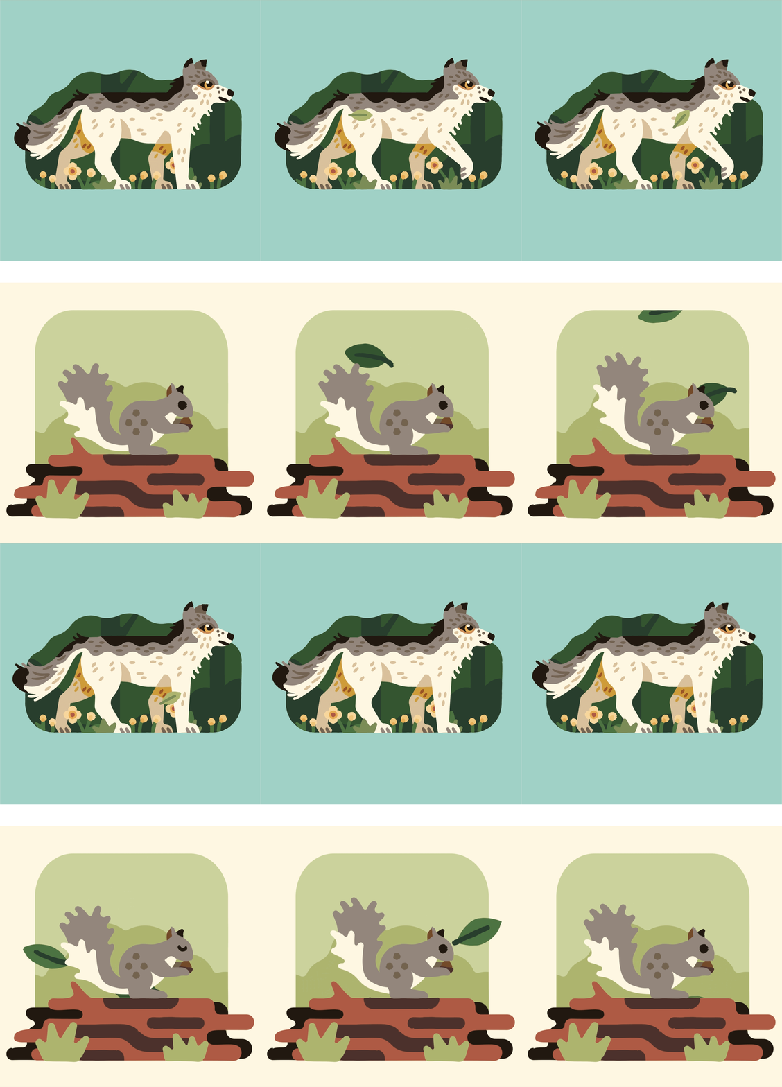
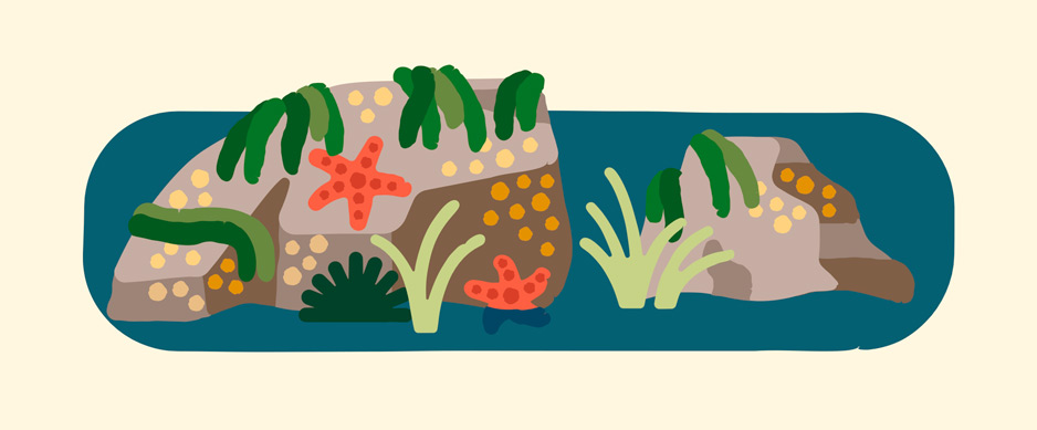
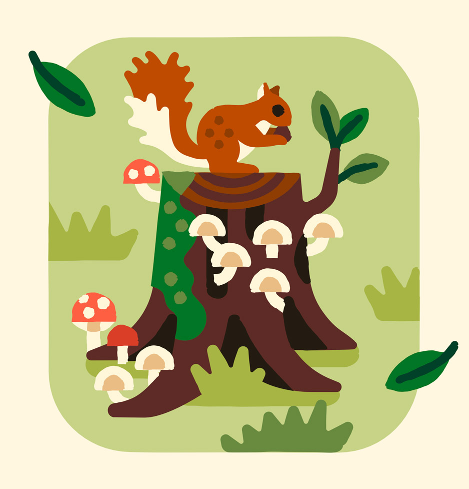
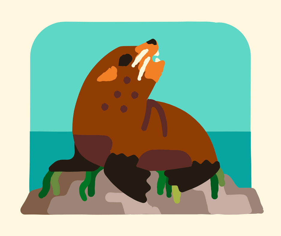
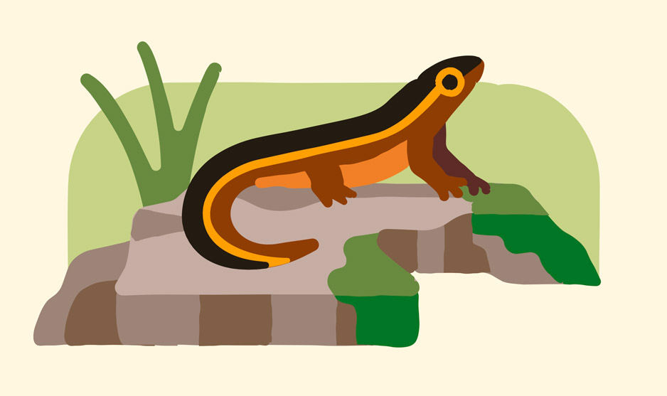
Flora and Fauna
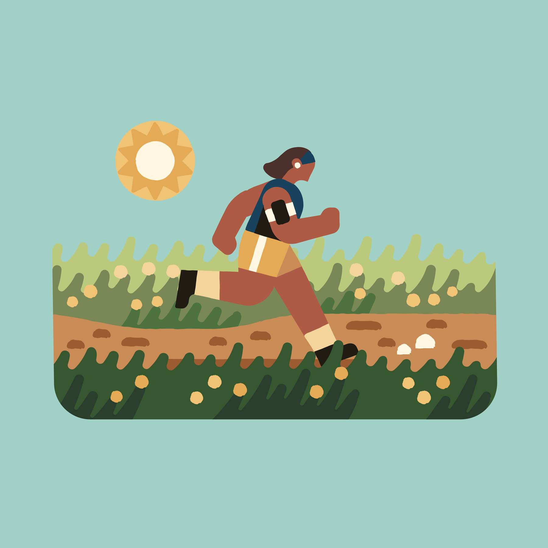
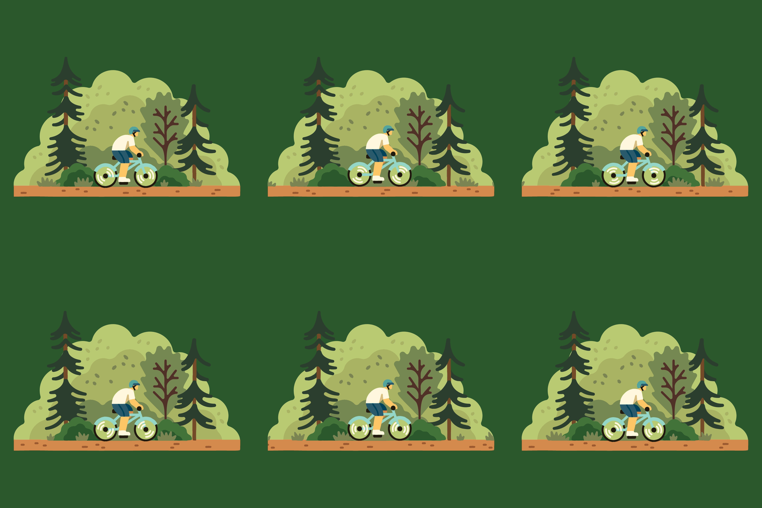
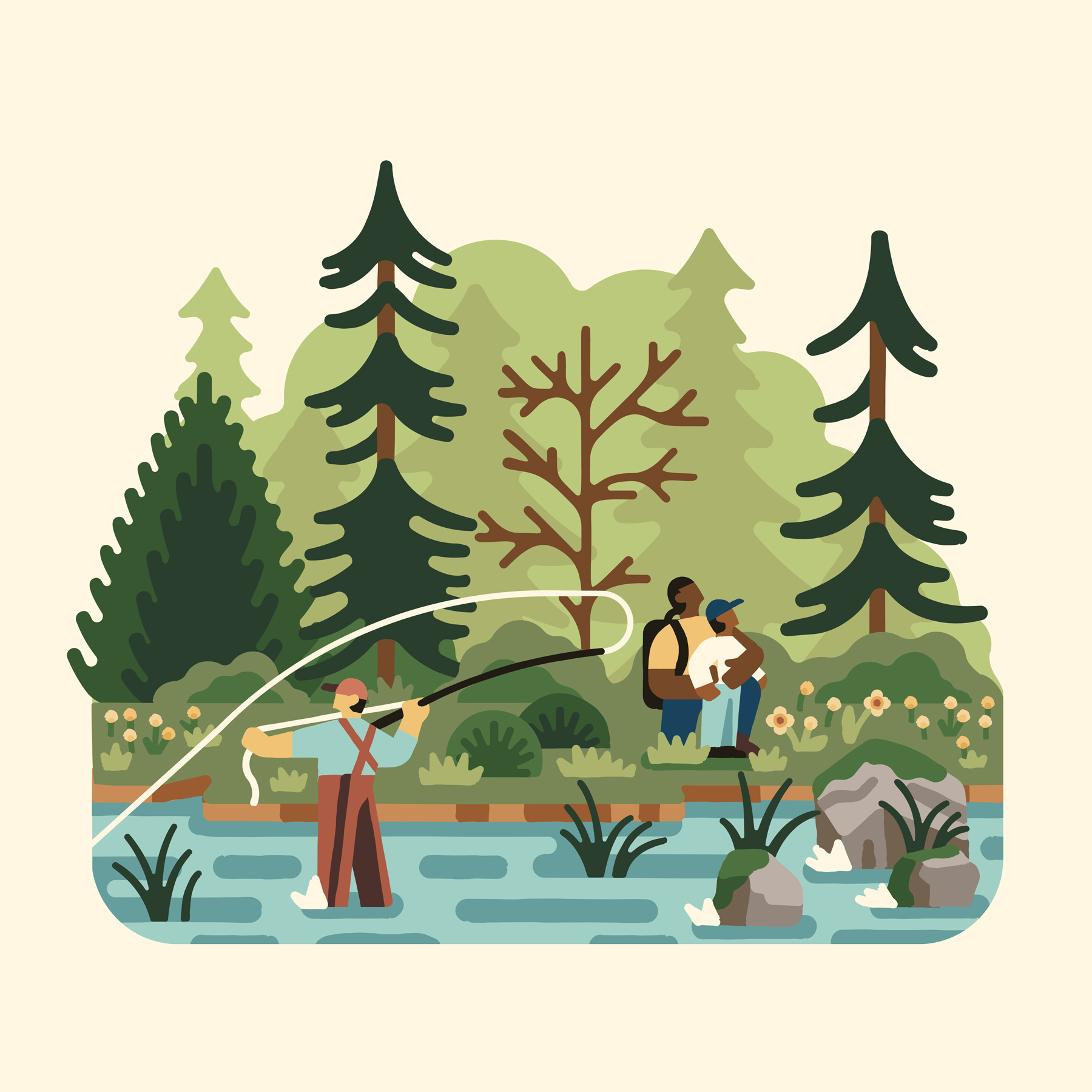
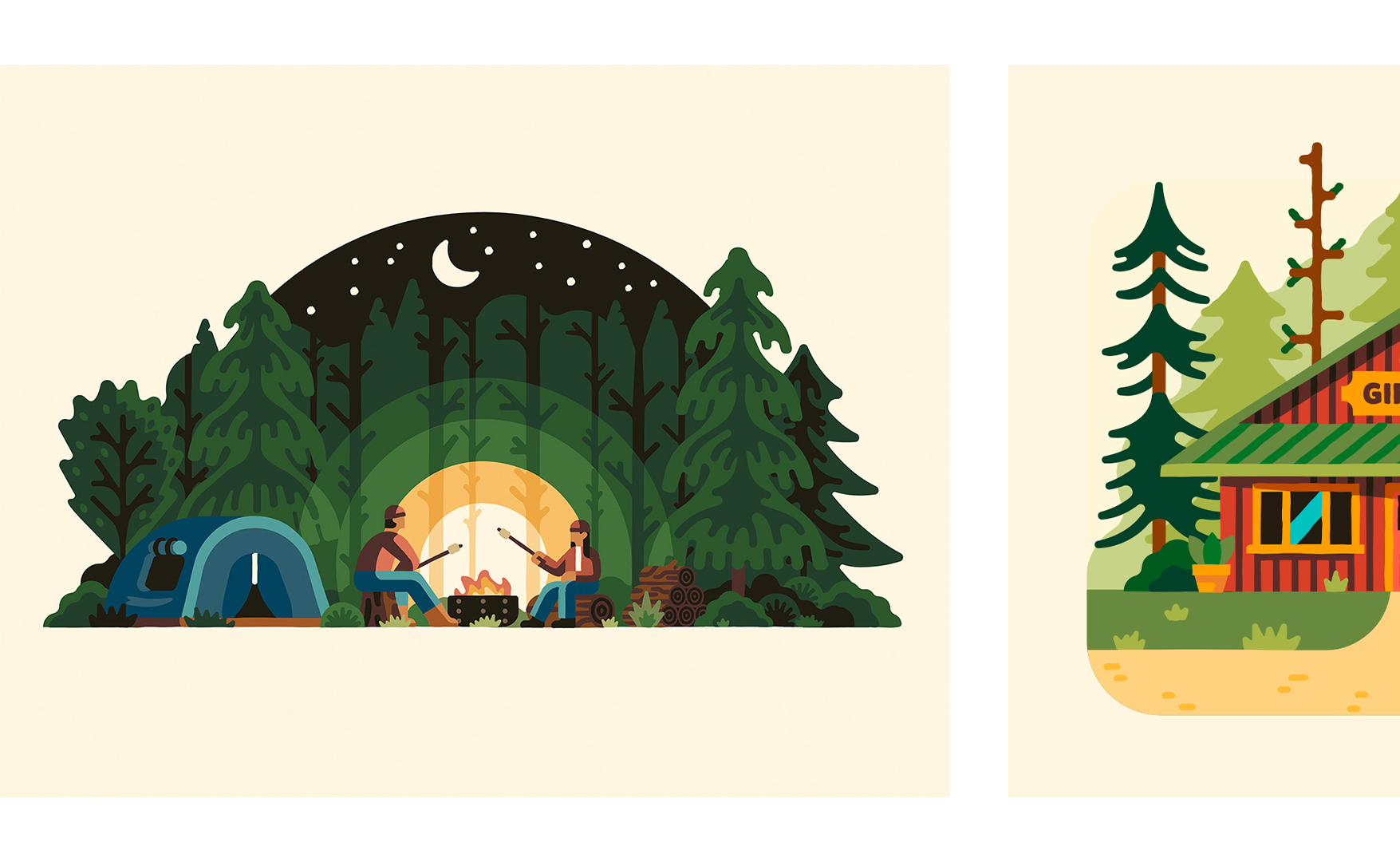
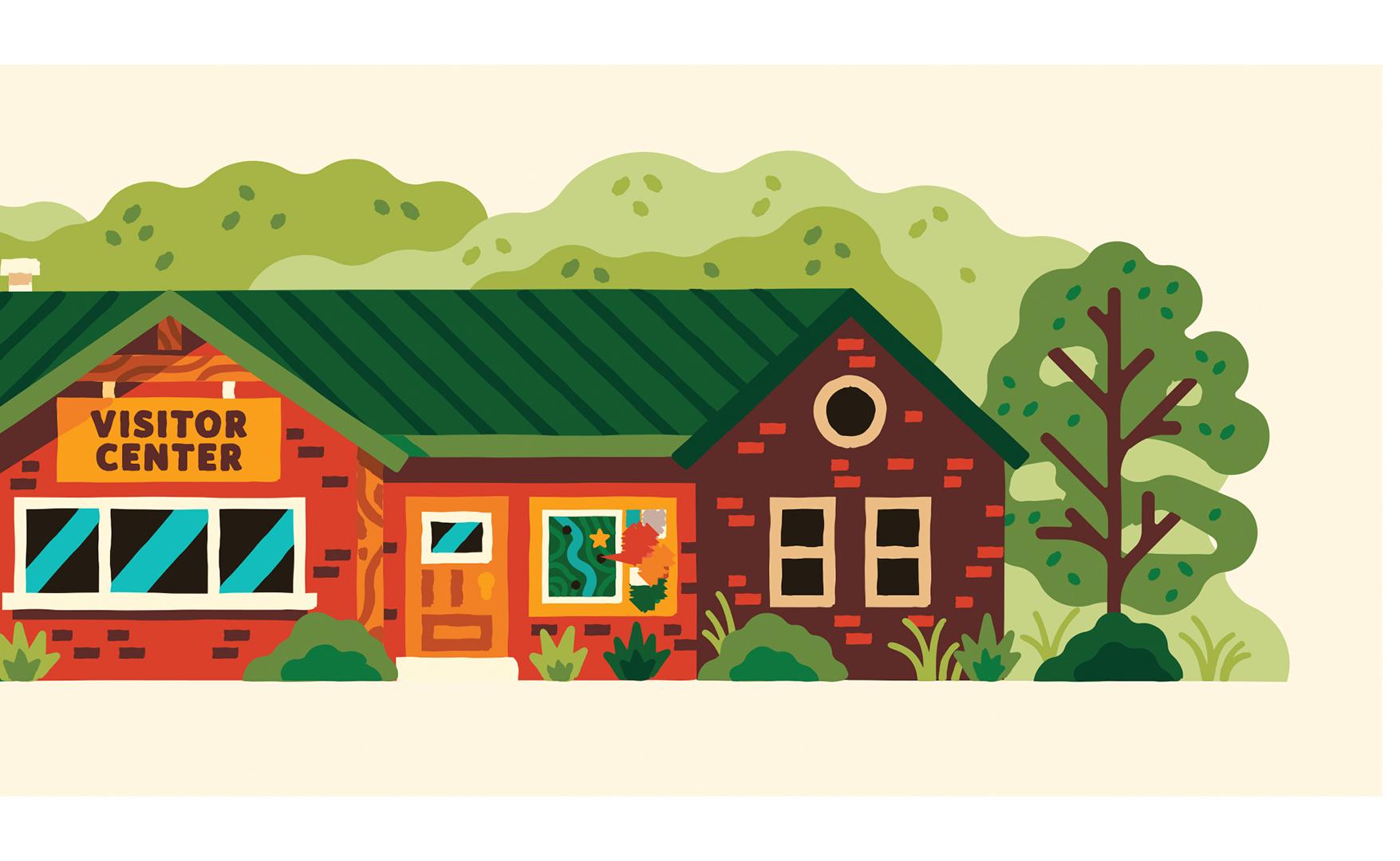
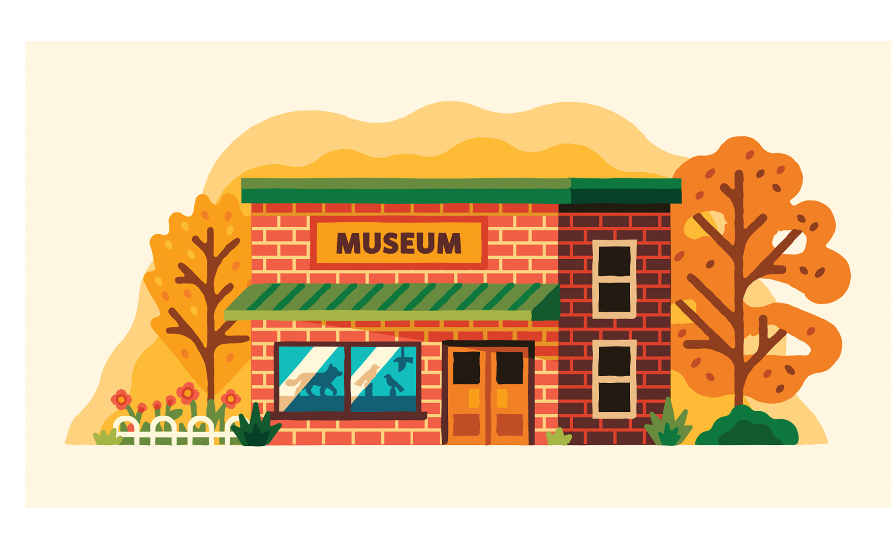
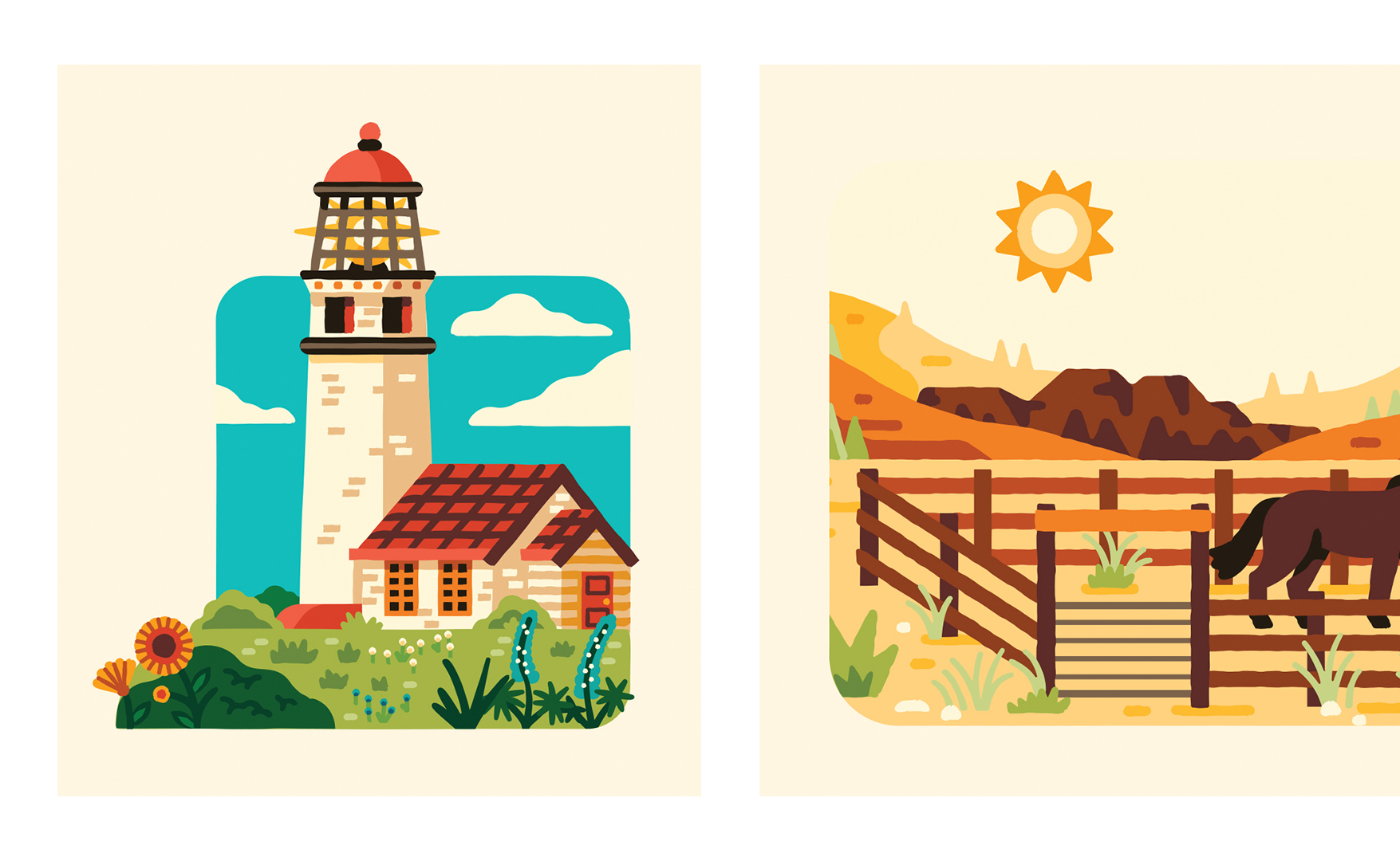
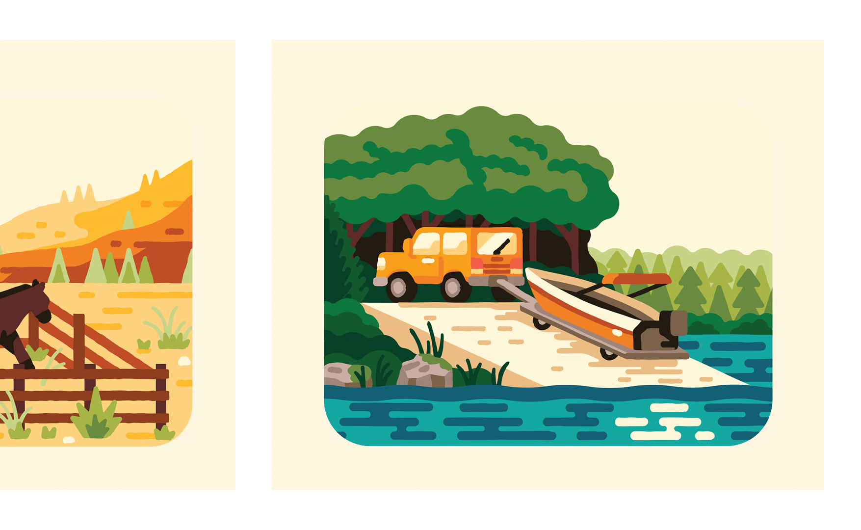
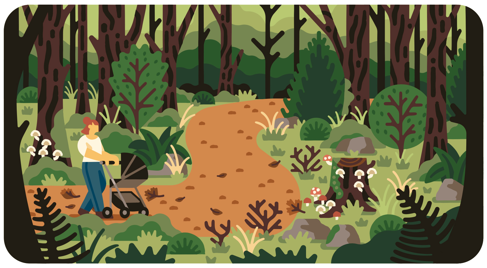
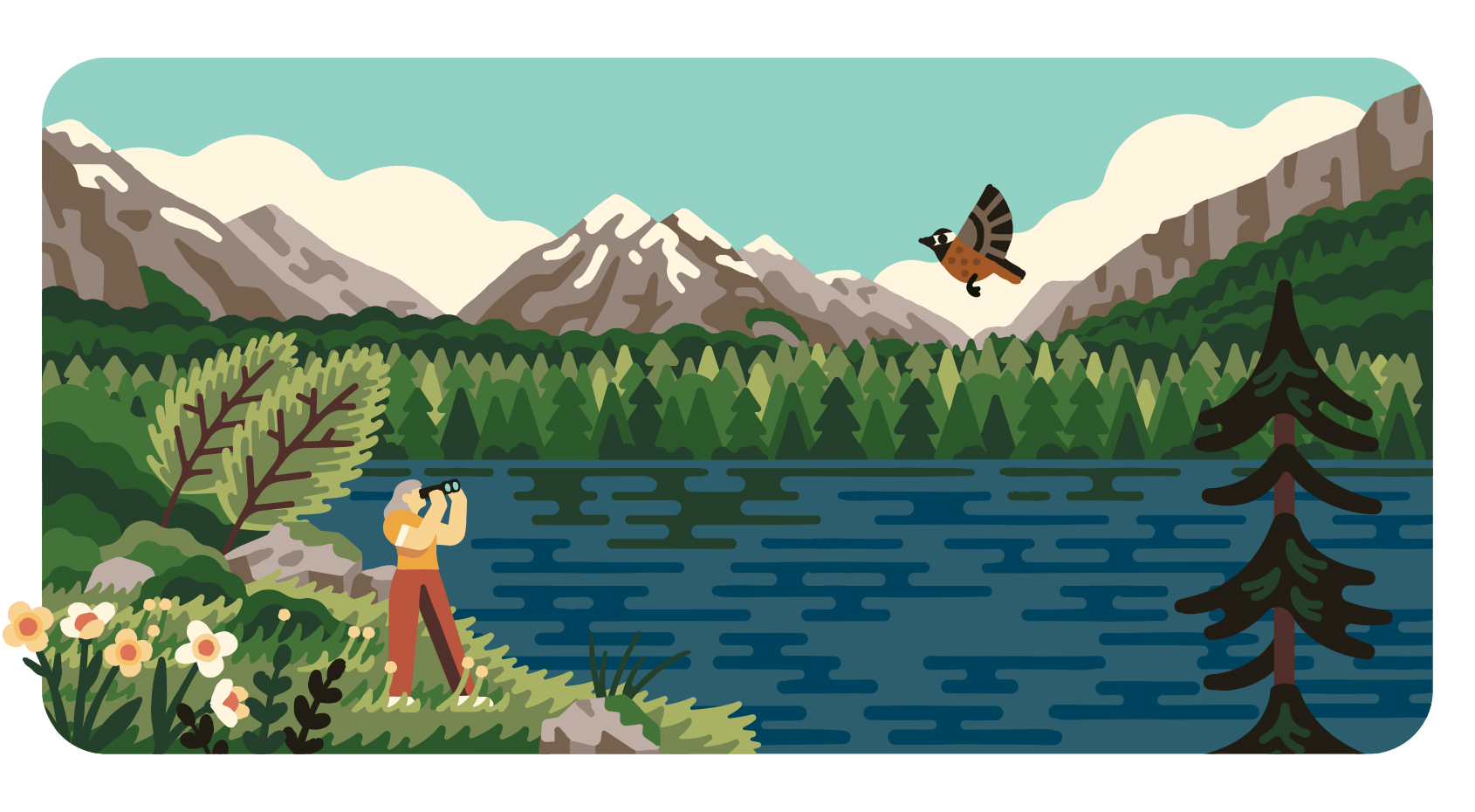
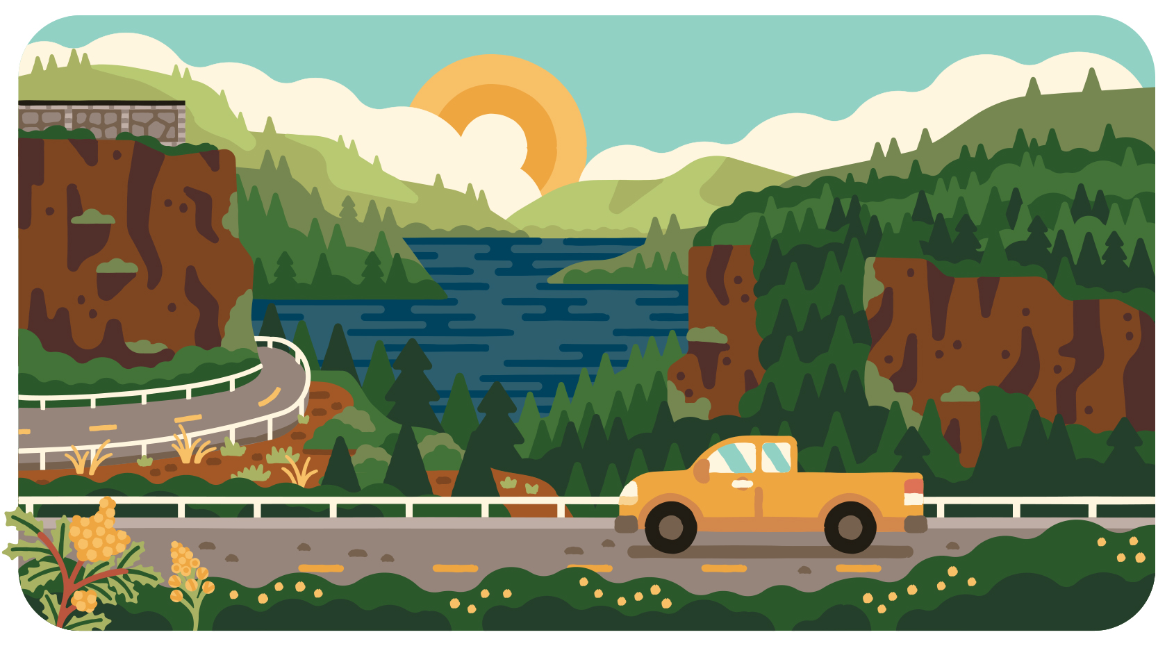
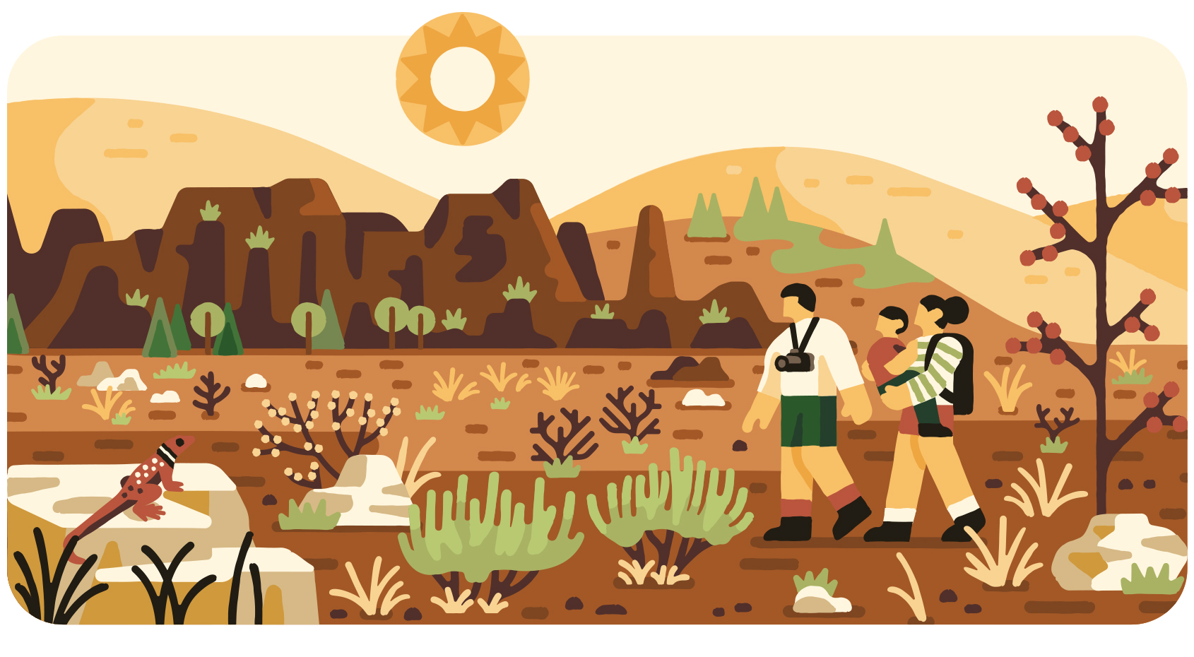
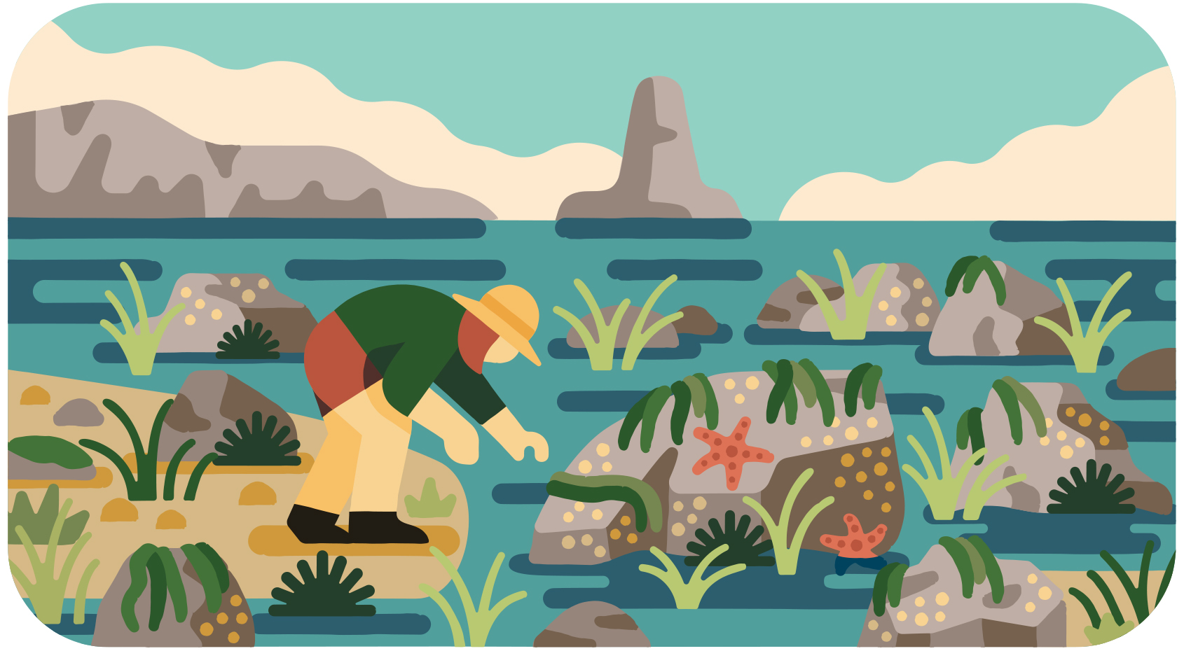
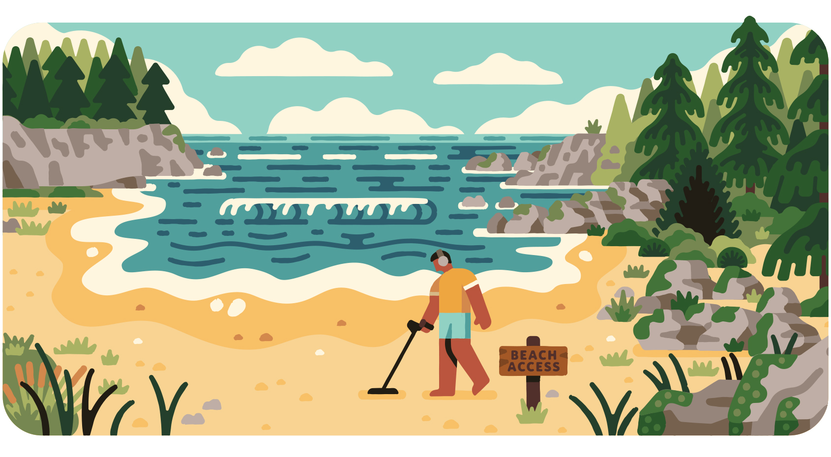
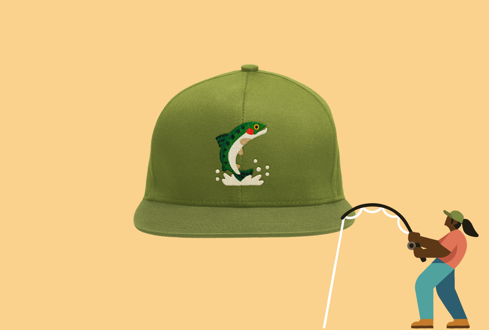
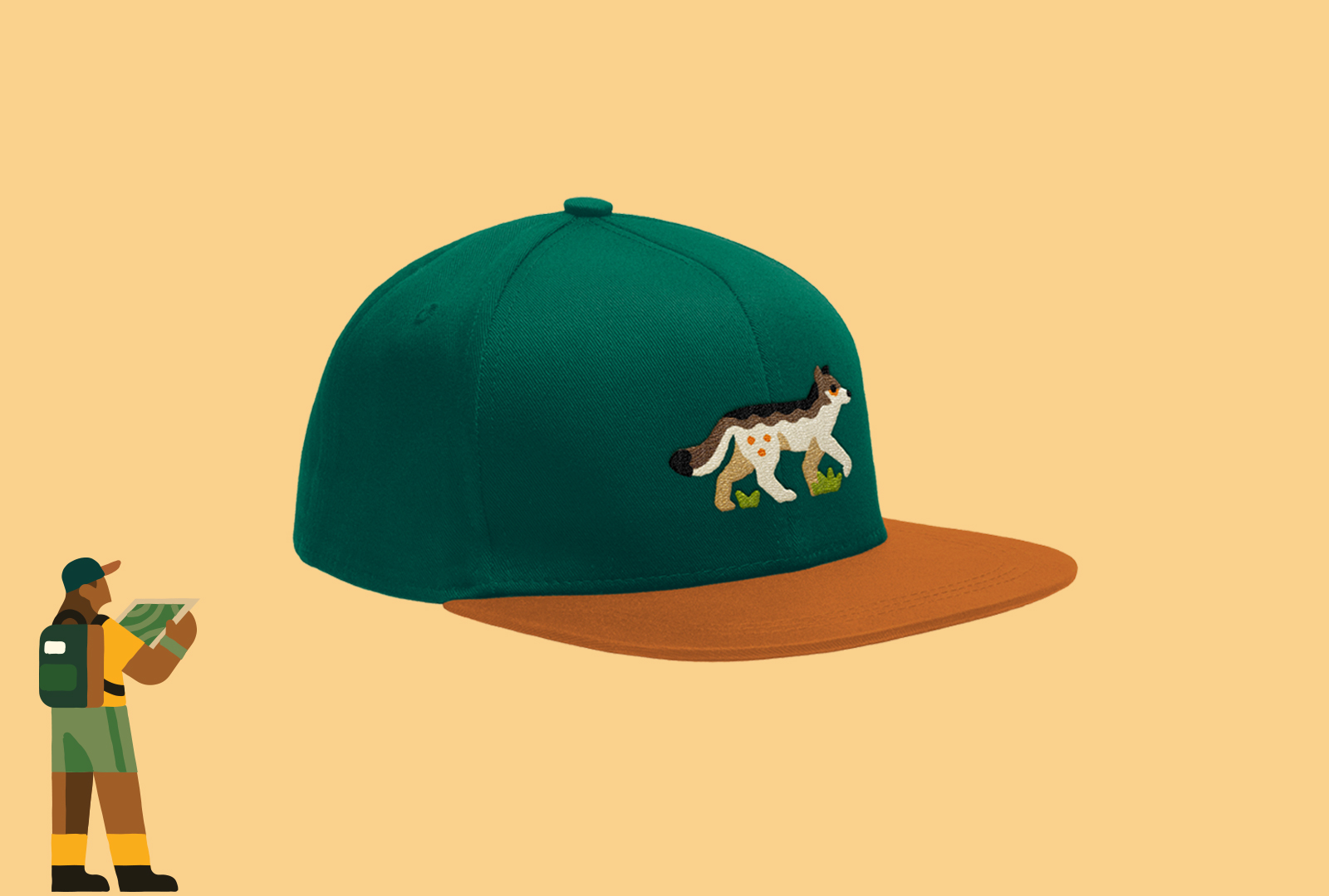
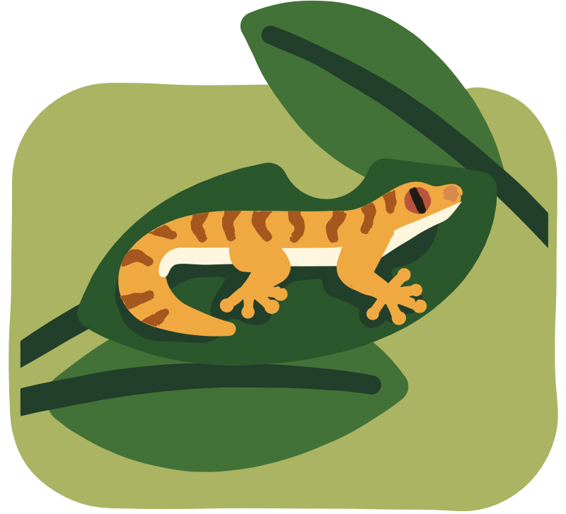
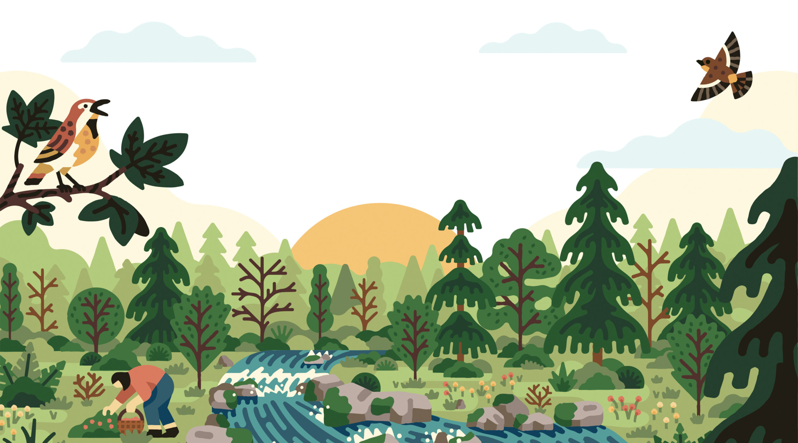
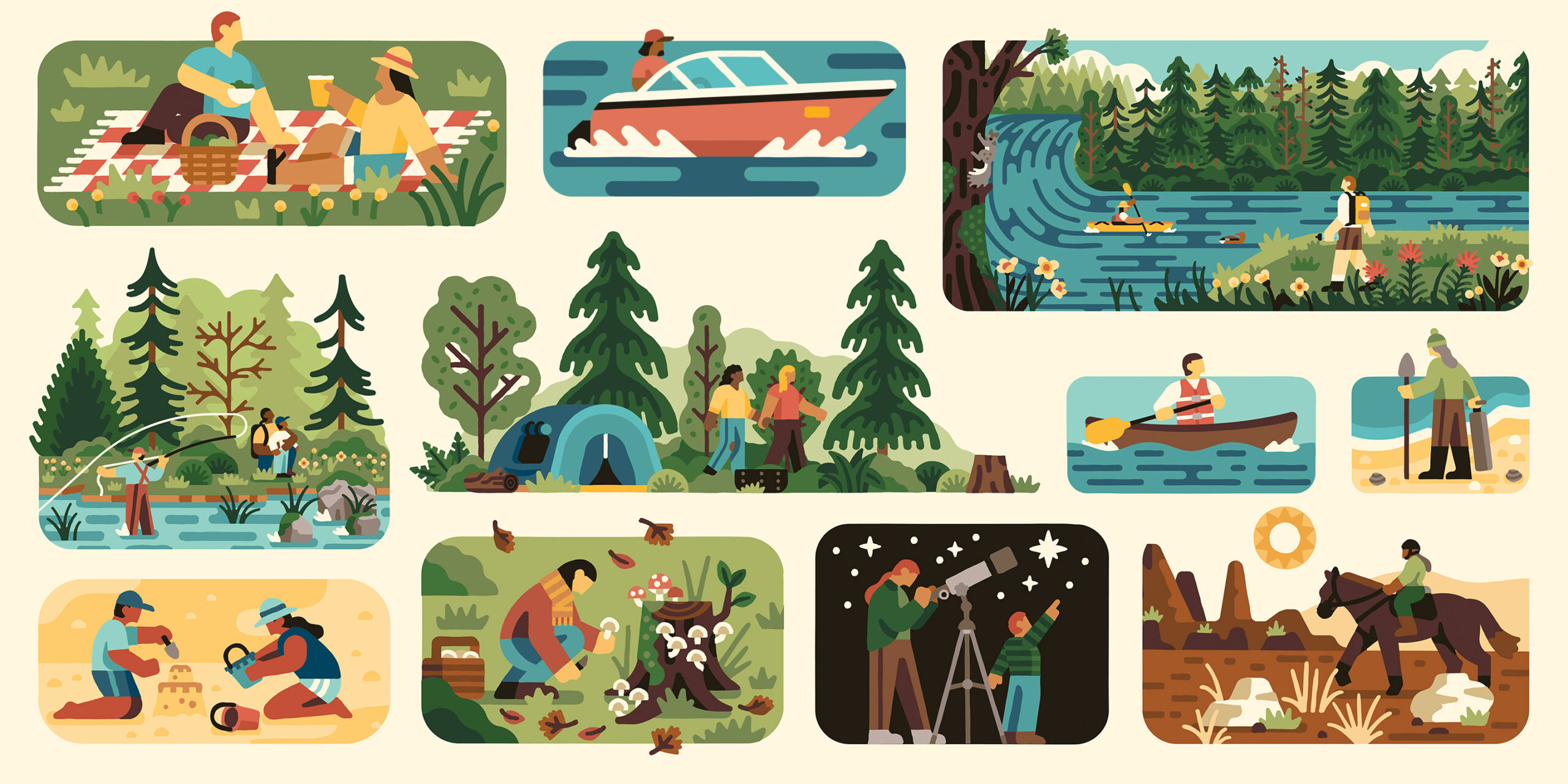
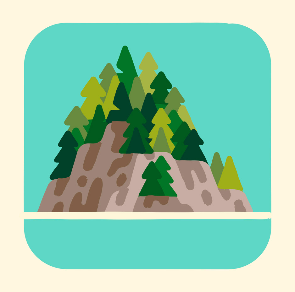
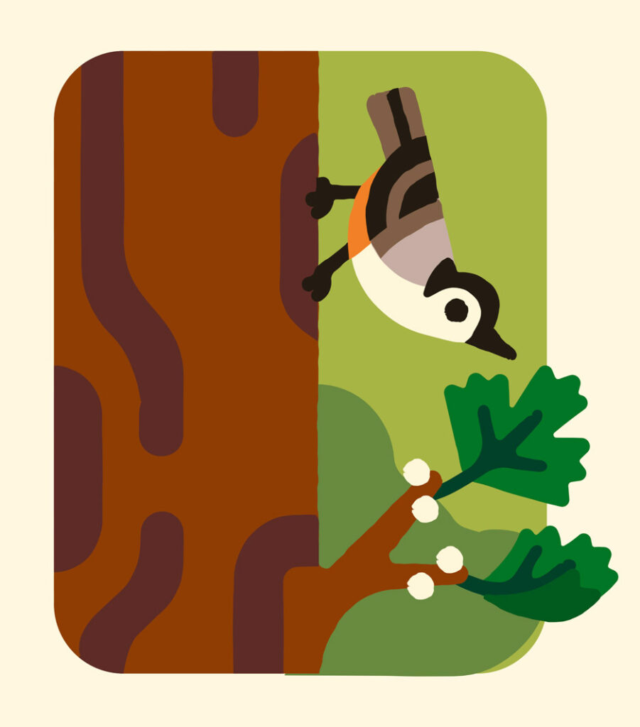
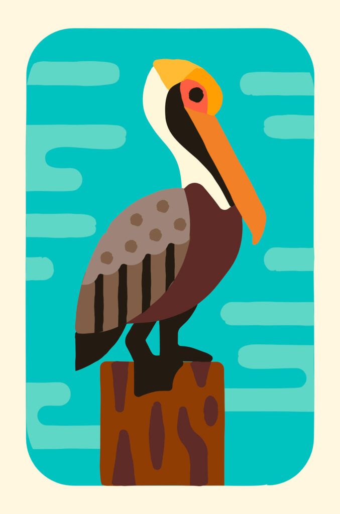
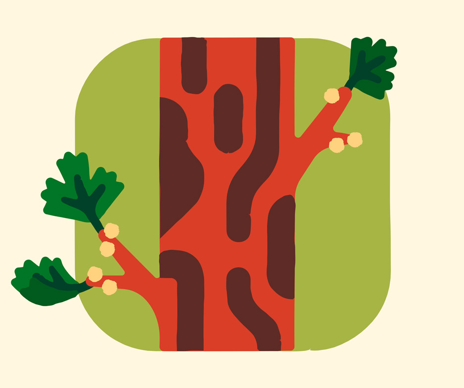
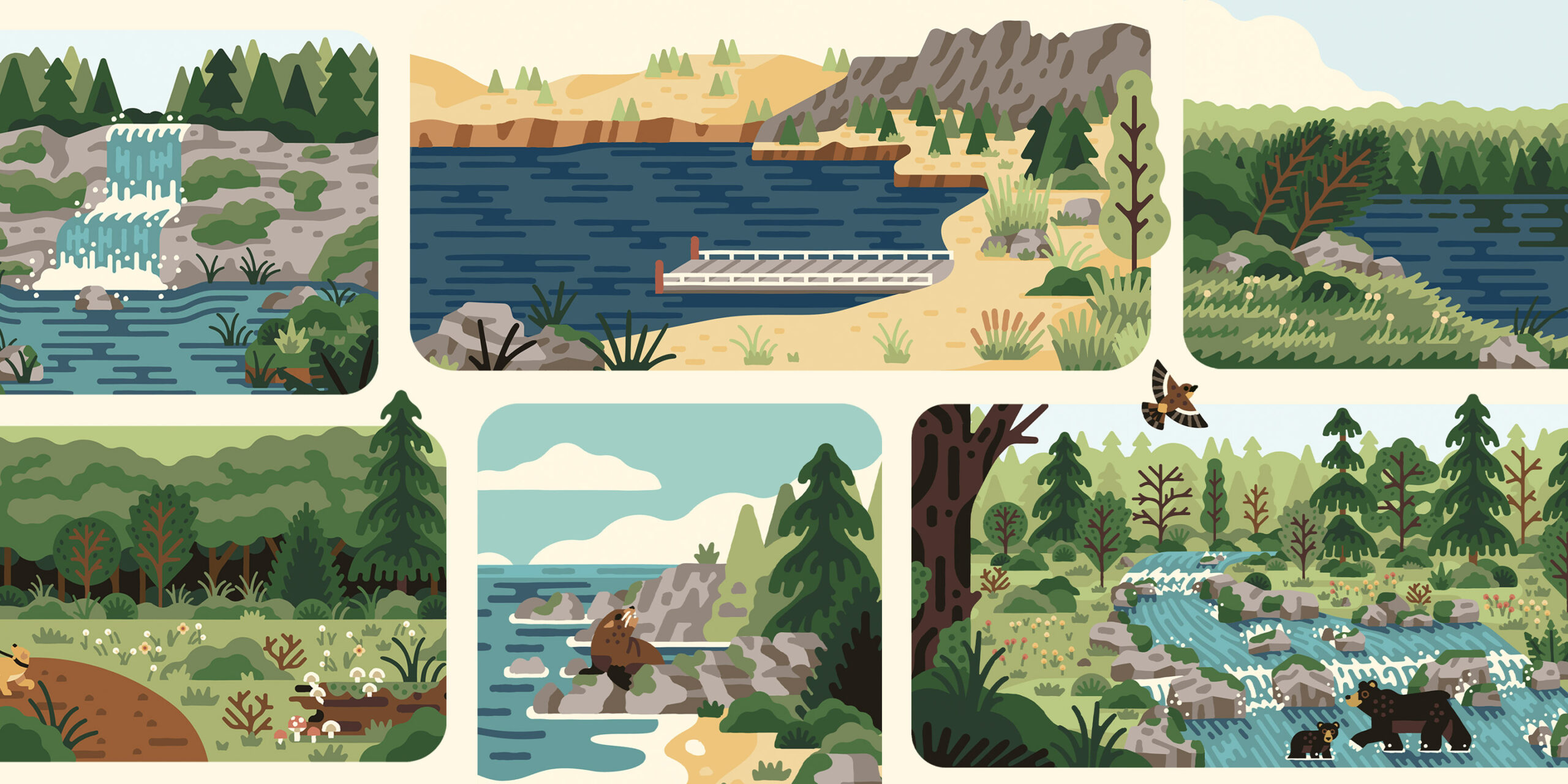
Storytelling through Scenes: With a total of 255 state parks in the diverse biome of Oregon it was impossible to build individual illustrations for each. We took the problem and developed a system of Activity Icons, Objects, Flora and Fauna that gave their team the ability to build any scenes and tell any story they might need. We designed 11 regional scenes that can be added to or subtracted, along with hundreds of individual plants, animals and objects so the OPRD team as well other design partners could create their own scenes for any need.
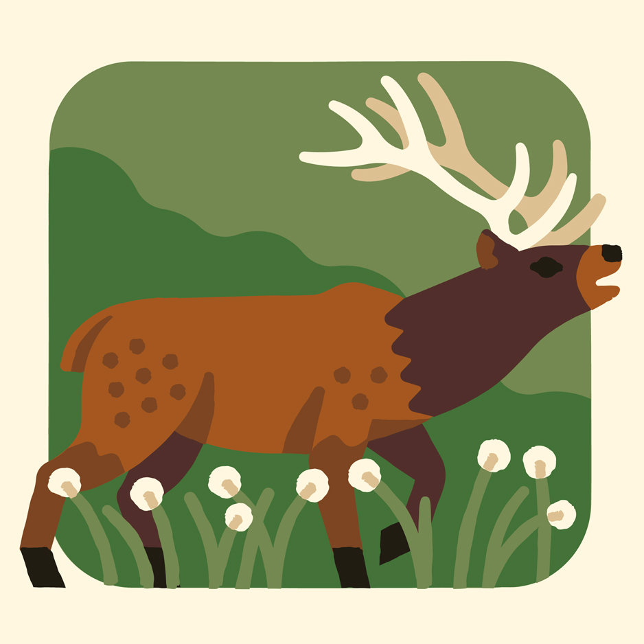
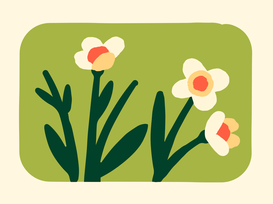
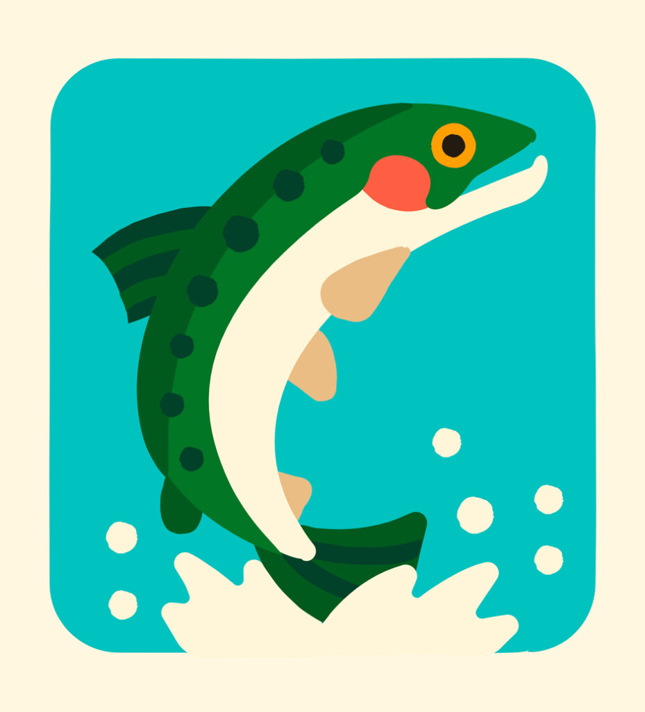
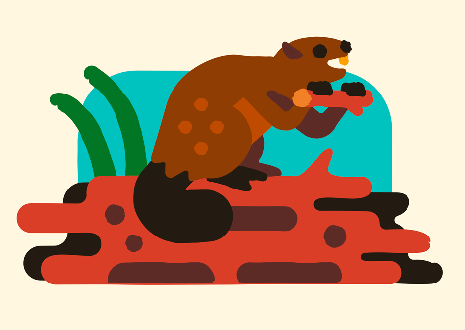
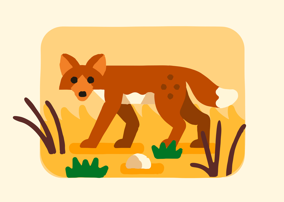
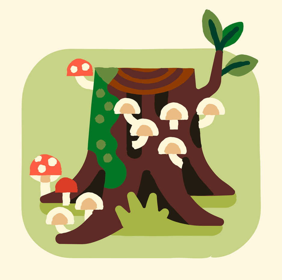
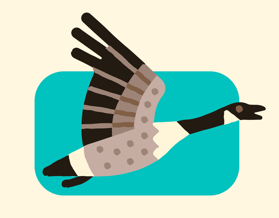
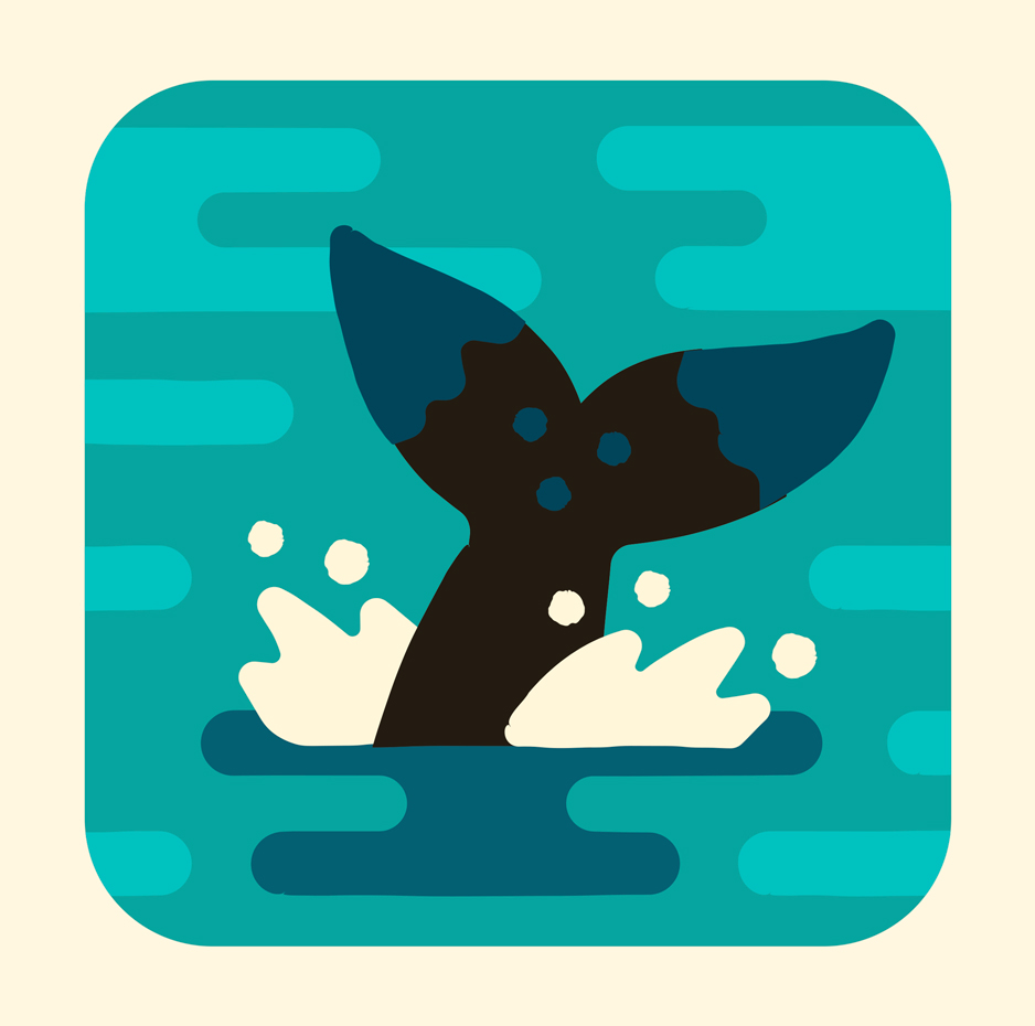
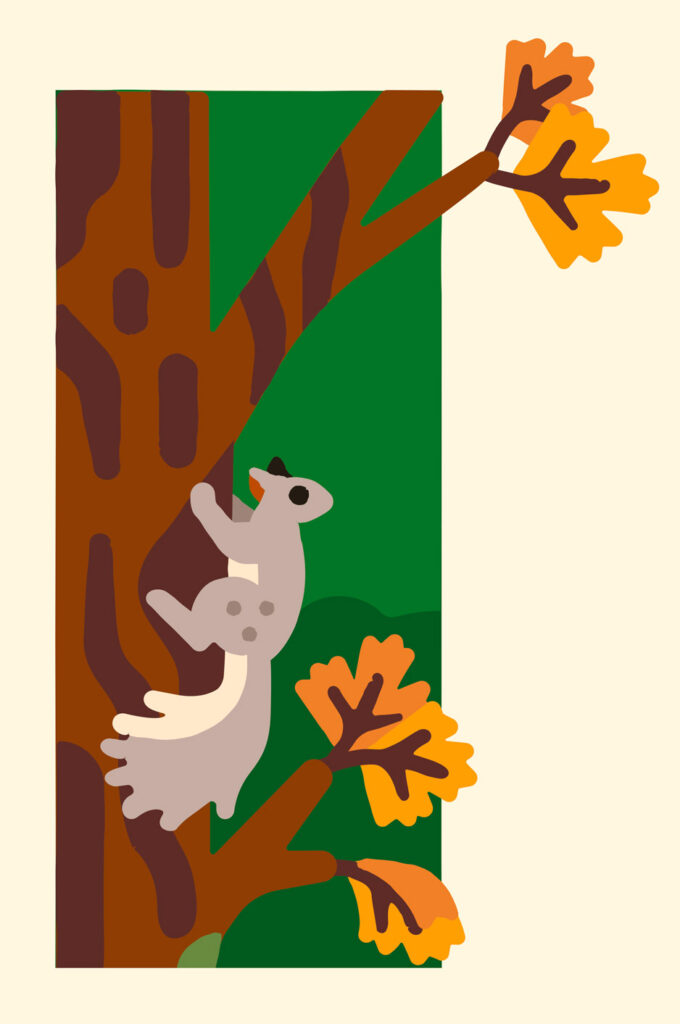
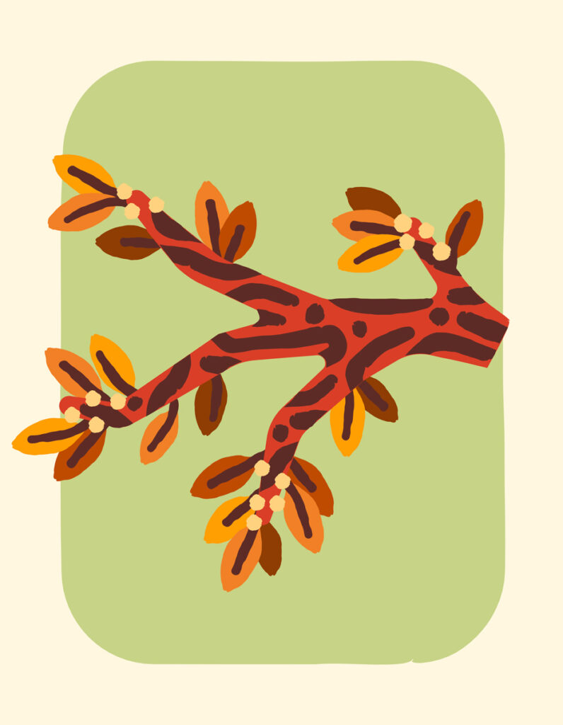
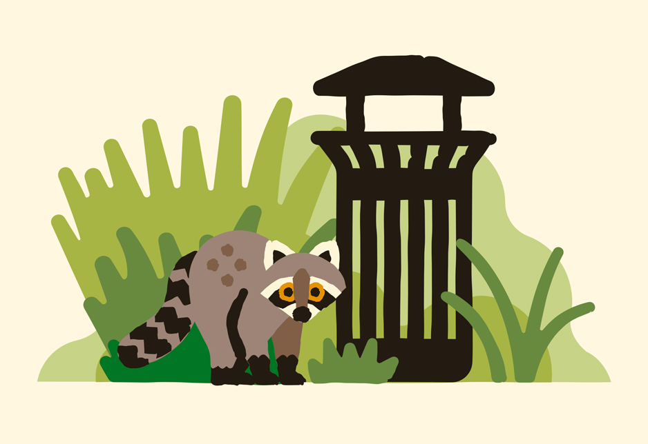
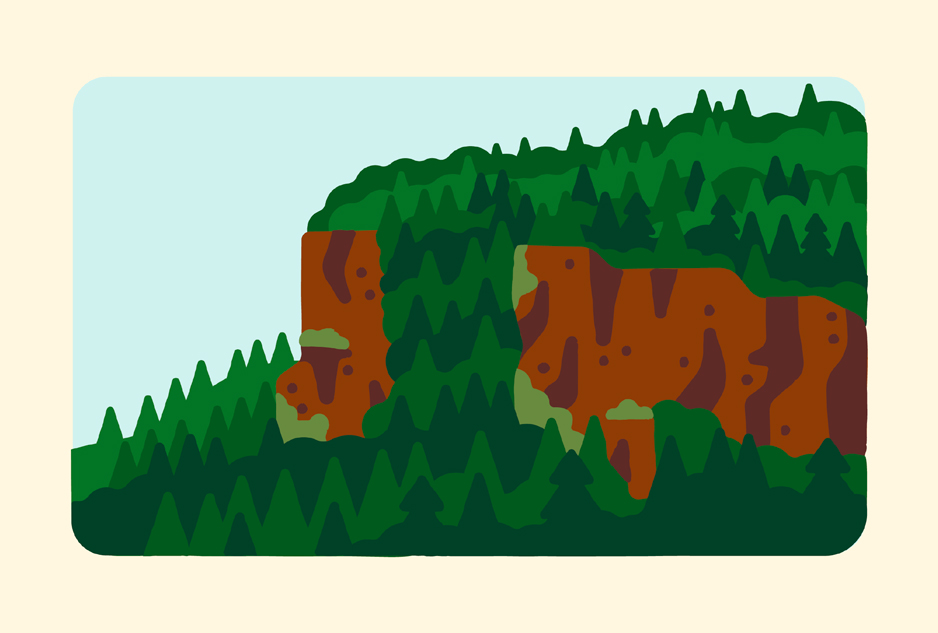
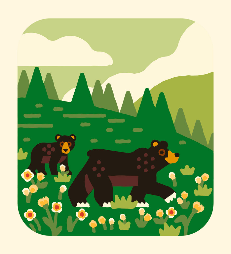
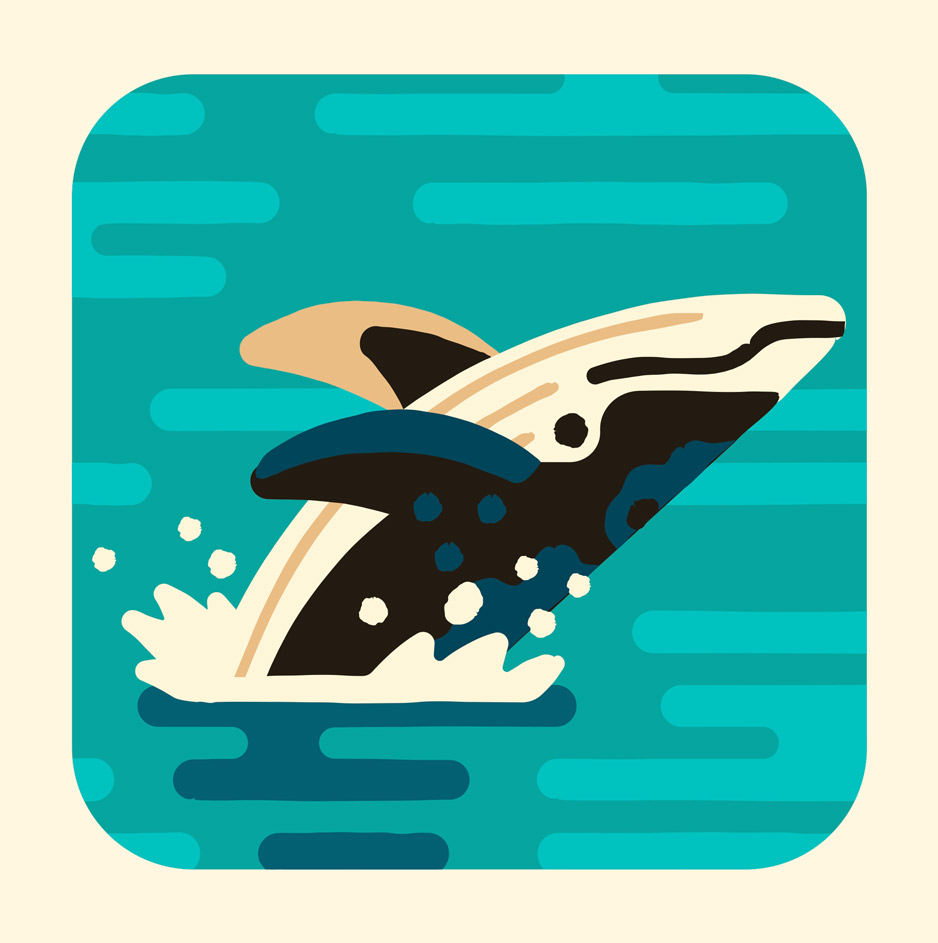
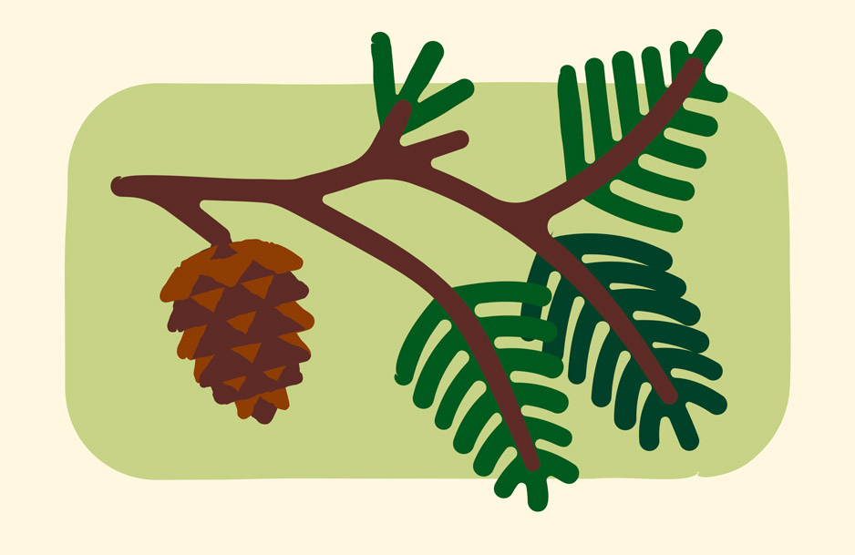
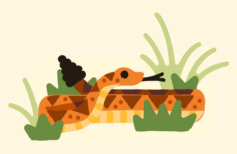
Hero vs. Icon
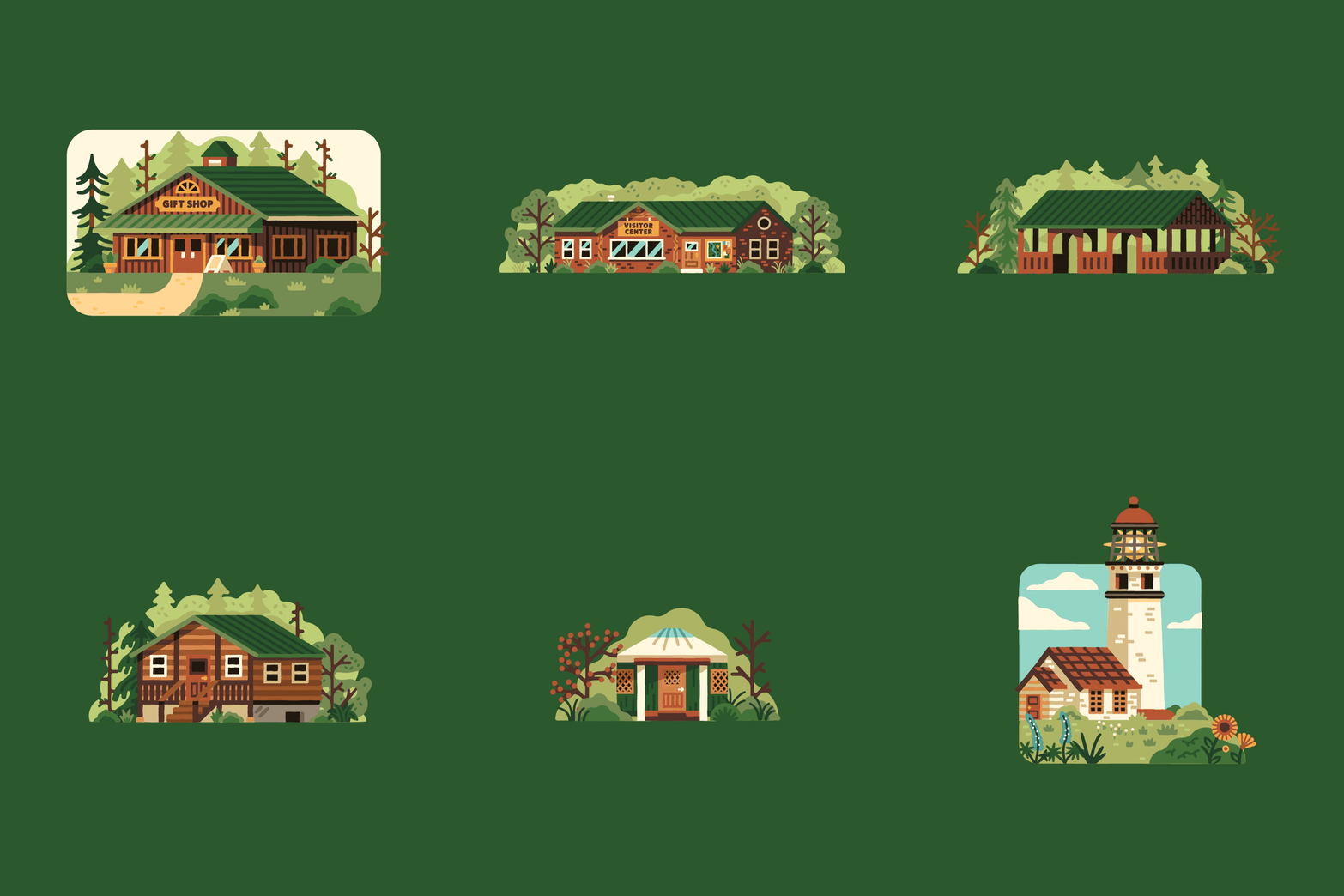
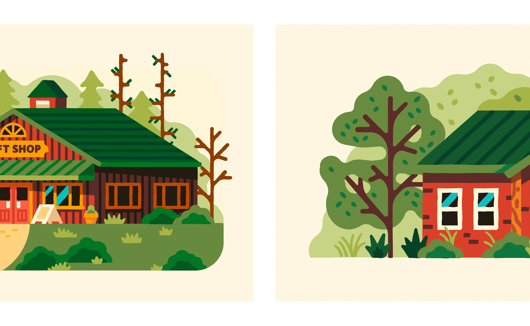
Early in the process, we discovered that there were multiple levels of complexity that were going to be needed to work for all applications. Whether it was a flier to celebrate a beloved lighthouse or a general scene of the Oregon Coast. We created a system of Hero and Icon illustrations that could be swapped out to fit the right level of detail for the situation. We applied this system through Animals and Facilities so they could live on their own and within larger scenes.
